The magnificent bears of the glorious nation of Finland
Bears per 1000 square km in Finland, visualized as bears.
Read MoreHighway access in Europe
Areas that are within 10 minutes of an exit are emphasized on this map, to give an indication of how
Read More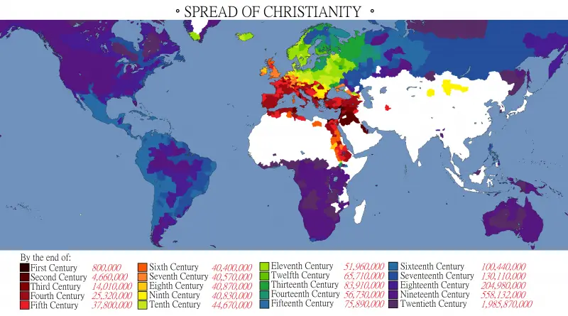
Spread Of Christianity
Christianity originated in the province of Judea out of Jewish culture in the mid-1st century AD, expanded within the Roman Empire. As Christianity became distanced from its Jewish origins, it began to include elements of other cultures and forms of thinking.
Read More