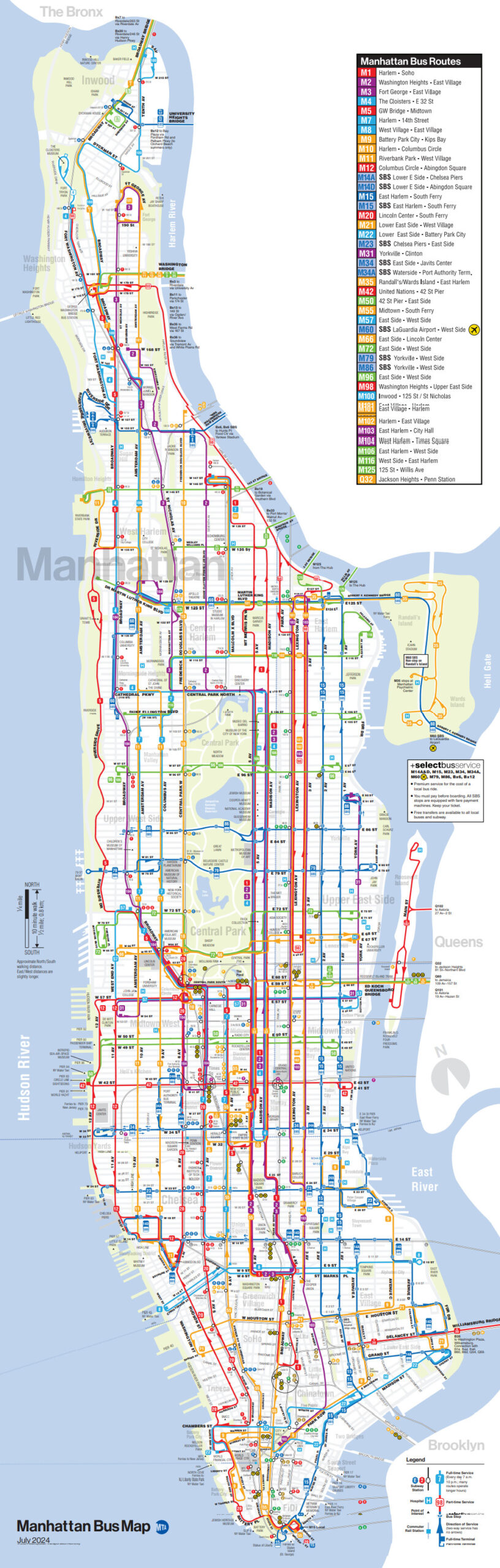
CitiesInternetMetro mapsPolitical mapsSportTransport Map of NYC subway system that shows how many calories you would burn walking (or swimming) between stations November 6, 2015 Alex Related Posts:NYC Subway: Map vs. Geographic DistancesNew York City Transportation Accessibility:…New York City Maps: A Visual Journey Through the Big AppleMap of Paris subway system that shows how many…How the World was Imagined: First Maps and AtlasesComprehensive map of the entire New York - Newark -…The Best Board Games of 2025The US & UK roads With The Biggest Gaps Between Toilets