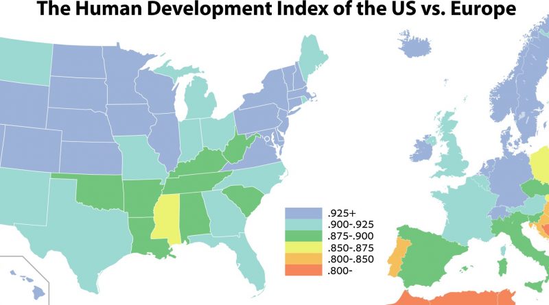
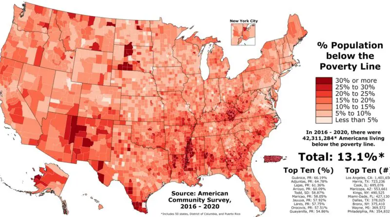
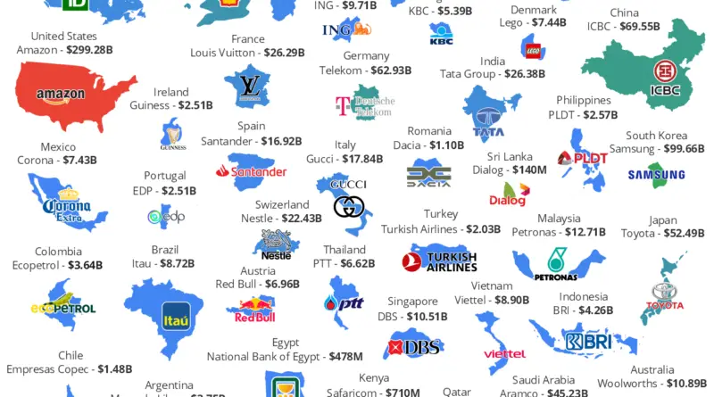
Skip to content
Vivid Maps Logo

Vivid Maps

Maps that explain the World

  • Atlases
  • Map Posters
  • Scratch Maps
  • Globes

Economic maps

Maps to explain economic geography.

Richest countries in the world
Economic maps 

Average wealth per adult (2017)

February 26, 2018 Alex 0 Comments Maps of world

The United States, Ireland, Norway, Switzerland, Australia and New Zealand are the richest countries in the world.

Read more
Jurisdictions With Mandatory Paid Sick
Economic maps 

US Jurisdictions With Mandatory Paid Sick Leave

February 17, 2018 Alex 0 Comments United States

Michael Huntington   Non-statewide jurisdictions: DISTRICT OF COLUMBIA – District of Columbia ILLINOIS – The City of Chicago MARYLAND –

Read more
The world split into 7 equal areas of population
Economic maps Population 

The Splitting of the World

February 13, 2018 Alex 0 Comments

The world split into seven equal areas of population Continents by population 1. Asia – 4,436,224,000 (59.69%) 2. Africa –

Read more
Government spending in Europe
Economic maps 

Government spending of European countries

February 8, 2018 Alex 0 Comments Europe

Reddit user: trinitronbxb; Data: Heritage.org Finland has highest government spending as a percent of Gross Domestic Product. Government spending as %

Read more
Economic maps 

Countries With A Smaller GDP Than Total Bitcoin Market Cap

February 7, 2018 Alex 0 Comments

Source: www.merchantmachine.co.uk The total Bitcoin Market Cap was $116.5 billion. It would place the market value as being smaller than Hungary ($125.7

Read more
U.S. state minimum wages
Economic maps 

The ever-changing minimum wage (1970 – 2018)

February 1, 2018January 17, 2019 Alex 1 Comment United States

The interactive map below depicts state minimum wages from 1970 through 2018, adjusted for inflation to 2017 dollars. States that

Read more
Mobility and economical success
Economic maps 

The Geography of Upward Mobility in the U.S.

January 25, 2018 Alex 0 Comments United States

Chances of reaching the top fifth starting from the bottom fifth by metro area. Green color – more upward mobility,

Read more
Economic maps 

Percent of population who describes their U.S. state as the “Worst possible state to live in”

January 11, 2018December 25, 2018 Alex 6 Comments United States

Illinois, Connecticut, Mississippi, Lousiana are worst possible U.S. states to live in. These states have the lower level of health and

Read more
Economic maps 

People who cannot afford to keep their home adequately warm

January 6, 2018 Alex 0 Comments Europe

Reddit user: JoDi2019 In Greece, most people here barely have enough money to pay the bills for heating purposes.

Read more
Economic maps 

The Groceries Index in Europe (2017)

January 6, 2018 Alex 0 Comments Europe

Groceries Index measuring the estimated average cost of groceries in each European country in comparison to New York City. bezzleford

Read more
Page 10 of 69« First«...89101112...203040...»Last »

Find Us On Facebook

Vivid Maps

Trending now

  • Map of U.S. Population Density Change
    Animated maps , Demography , News , Vivid maps
  • Business
  • 4,500 years of Battles in 5 minutes
    Animated maps , Historical Maps , Wars
  • Cities , Population
  • Antarctic and Greenland ice sheet melting
    Environment maps , Oceans

Related Products

Push pin maps · Globe drinks cabinets · Maps of the United States · Board games · Monopoly · Map-based strategy board games · History Board Games · Coloring Books · Handheld GPS · GPS Watches · GPS Trackers

Vivid Maps Tools

– Find cities with a similar climate
– Find cities with a similar climate (2050)
– How hot cities could be in 2050
– The U.S. Population Lines
– Convert Latitude/Longitude

– About

Copyright © 2023 Vivid Maps. All rights reserved.