British music mapped
The United Kingdom has created some of the biggest names in music. From classic rock ‘n’ roll to grime, there’s
Read More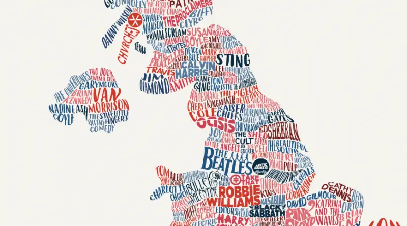
The United Kingdom has created some of the biggest names in music. From classic rock ‘n’ roll to grime, there’s
Read MoreThe map shows in real-time the voting in Germany’s federal elections on 24 September 2017 – for each of its
Read More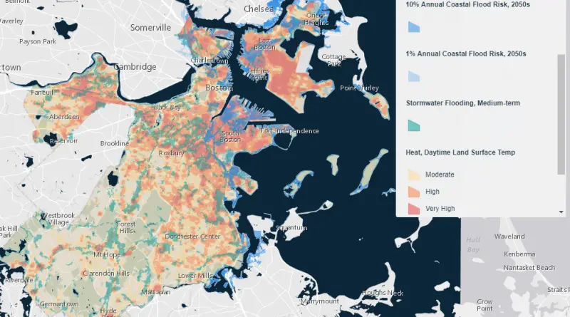
This mapping tool features data from Climate Ready Boston. Explore which areas of the city are projected to be at
Read MoreDespite a warm-temperate climate similar to that of southern Japan, the coastal plain of the southeastern USA is usually described
Read MoreCatholics as a percentage of all residents (1890 – 2010) Catholics as a percentage of all residents (2010) Most Catholic States
Read MoreNew York City cycling incident map and cyclists injured by borough, by month, an hour of day charts. Related post: – New
Read MoreReddit user: Irmfried
Read MoreReddit user: Borysk5 Countries without compulsory schooling: Vatican, Oman, Bhutan, Solomon Islands.
Read More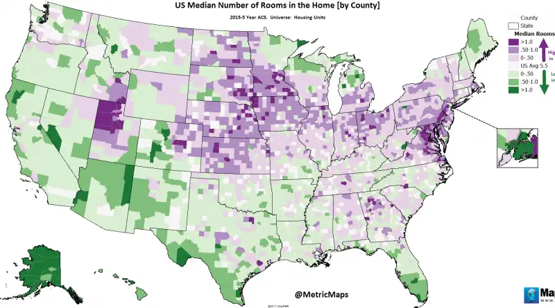
Via metricmaps
Read MoreRecently, widespread reports show that some SF property owners may be fraudulently claiming eviction reasons on rent-controlled properties to raise
Read More