Corruption perceptions index (2016)
Over two-thirds of the 176 countries and territories in this year’s index fall below the midpoint of our scale of
Read MorePolitical Maps show governmental and administrative borders of countries, provinces, states, and counties, the location of major cities, and other political units.
Over two-thirds of the 176 countries and territories in this year’s index fall below the midpoint of our scale of
Read MoreThe United States fell below the threshold for a “full democracy” in 2016 and is now considered a “flawed democracy”.
Read More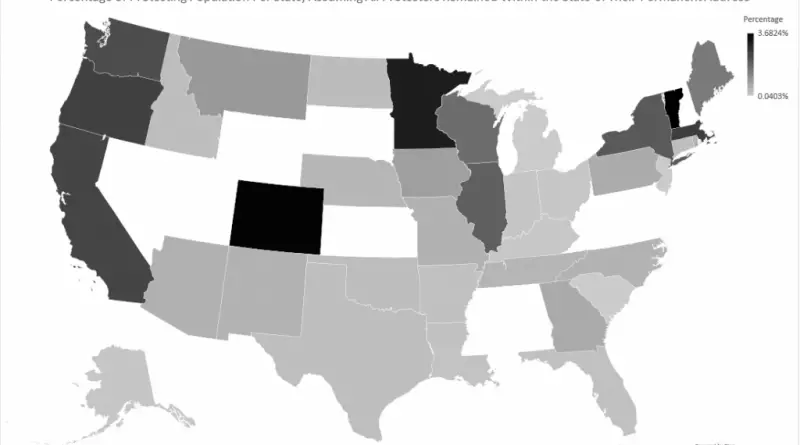
Reddit user: StoneHolder28 Women’s march around the world
Read More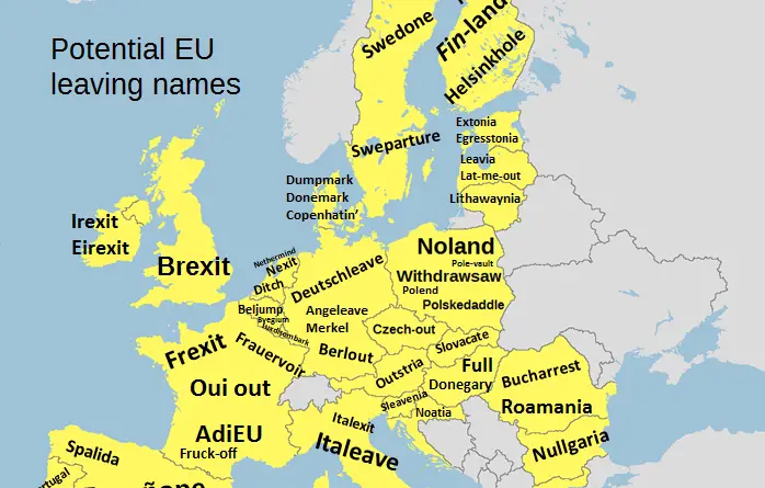
Reddit user: bezzleford
Read More
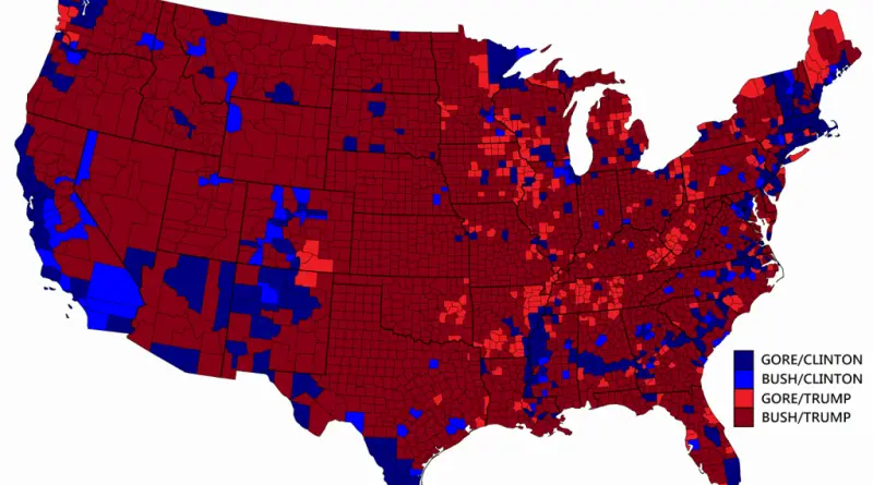
How each of the counties voted in the 2000 United States election vs 2016. Related posts: – TrumpLand and
Read MoreThe July 4, America celebrates independence from Great Britain. During that time, the United States was split into 13 separate colonies, which later developed and extended into the 50 U.S. states we have nowadays. But America isn’t only made up of 50 states. It may also be a nation composed of many tribes. This can be used as a basis for the cultural divisions of America into regions.
Read MoreBy Reddit user: parlezmoose
Read MoreHillary Clinton got nearly 2.9 million more votes than Donald Trump did. Still, Donald Trump called the majority in the Electoral College and won upset victories in the key Rust Belt region. Finally, Donald Trump got 304 electoral votes and Clinton just 227.
Read MoreThis interactive map creates randomly-generated state boundaries for the United States, and see who would recent presidential elections under the
Read More