US states where you can’t pump your own gas
This map shows the two remaining U.S. states where you can’t always pump your own gas, and explains why full-service stations still survive in a mostly self-serve country
Read More
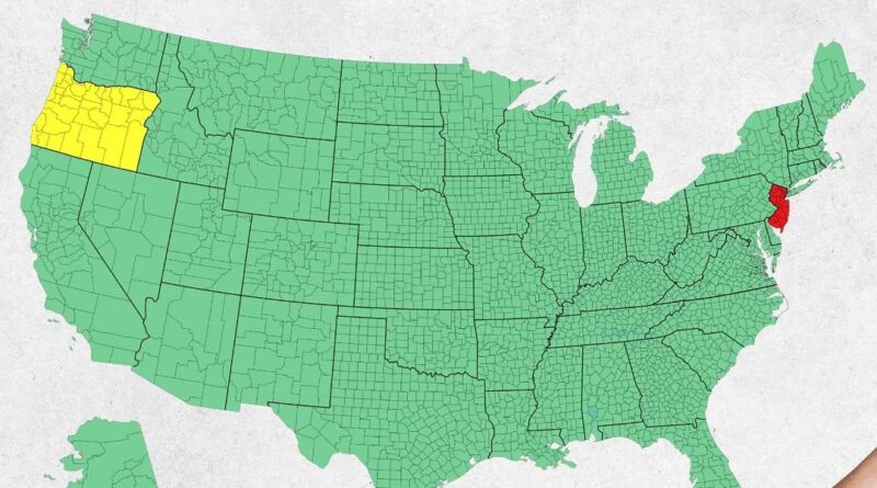
This map shows the two remaining U.S. states where you can’t always pump your own gas, and explains why full-service stations still survive in a mostly self-serve country
Read More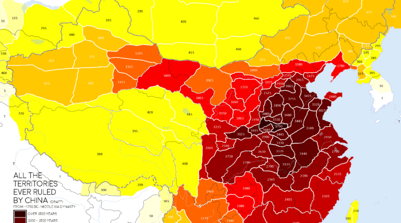
This map shows how China’s territory expanded and contracted over 3,000 years. From the Yellow River basin to the far edges of Central Asia, the post explores key historical events that defined China’s evolving borders.
Read More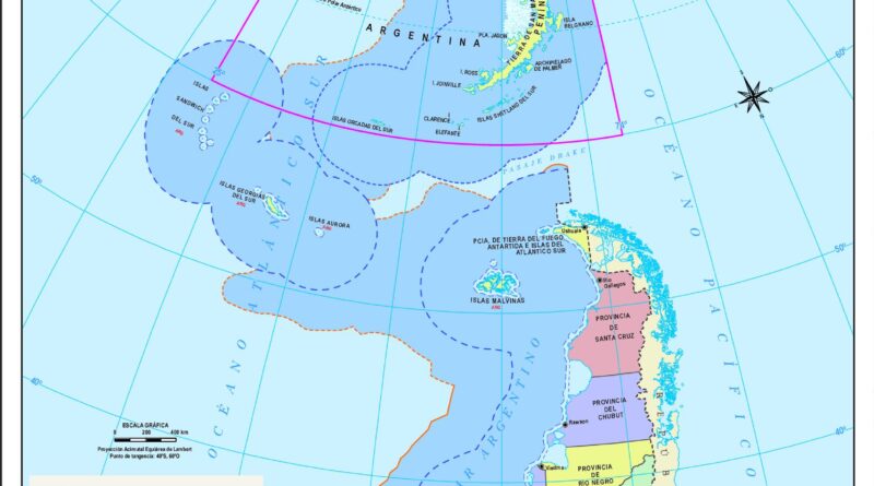
The South Pole is on top, Argentina is flipped, and the map shows far more than geography. This official Argentine map offers a fresh and revealing way to look at the world.
Read More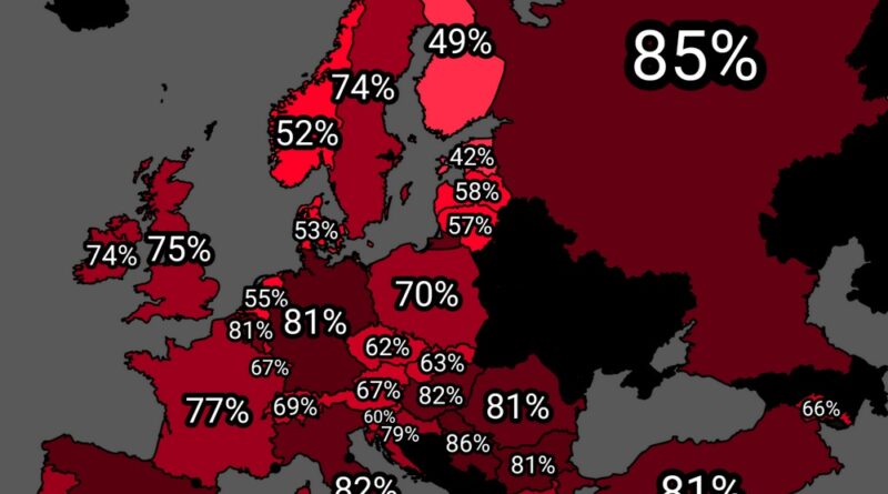
A new map shows how many people in each European country support higher taxes on the wealthy. The differences may surprise you—see where your country stands.
Read More
Over 100 million Americans suffer from allergies — but where you live can make a big difference. This post explores indoor and outdoor allergy severity across U.S. cities and states using a detailed study by HouseFresh. See how climate, pet ownership, and urban development shape allergy risk, and discover which places are hardest — or easiest — to breathe in.
Read More
Want to see how France’s borders evolved, why it borders Brazil, or where people say “chocolatine”? These 16 carefully selected maps show how geography, history, and identity intersect across the country and beyond.
Read More
You might know the official names of European capitals, but do you know what locals actually call them? This map of Europe shows the real nicknames residents use
Read More
Two detailed maps of South Korea’s fertility rates reveal a demographic crisis that’s already reshaping the world. With some districts recording just 0.39 children per woman, this isn’t just Korea’s challenge—it’s a preview of what lies ahead for countries everywhere.
Read More
Why do men have higher BMI than women in the U.S., but not in Nigeria or India? This map compares BMI by gender across the world—and uncovers what lifestyle, age, and culture might have to do with it.
Read More
A map plotting 100 classical composers’ birthplaces shows clear geographic clusters. We examine why certain countries and cities became breeding grounds for musical genius.
Read More