
Average commute times
The map below shows the commute thresholds for the U.S., based on data from the 2017 five-year American Community Survey. The percentages are cumulative. It begins with the percentage of workers with at least a zero minute commute roundtrip. Then it displays the percentages with at least a 10-minute commute, 20-minute, 30-minute, etc.
Read MoreSecond languages at tube stops
Each tube station has a circle coloured by, after English, the language most spoken by locals. The area of the
Read MoreA distorted map of blindness
Via www.viewsoftheworld.net
Read More10k+ people draw the former inner-german border
This is what happened. The video was created with leaflet-headless and leaflet-image. Via blog.webkid.io
Read MorePredicting the perceived safety of one million streetscapes
StreetScore is an algorithm that assigns a score to a street view based on how safe it looks to a
Read MoreSoil loss by water erosion
Source: www.europa.eu
Read More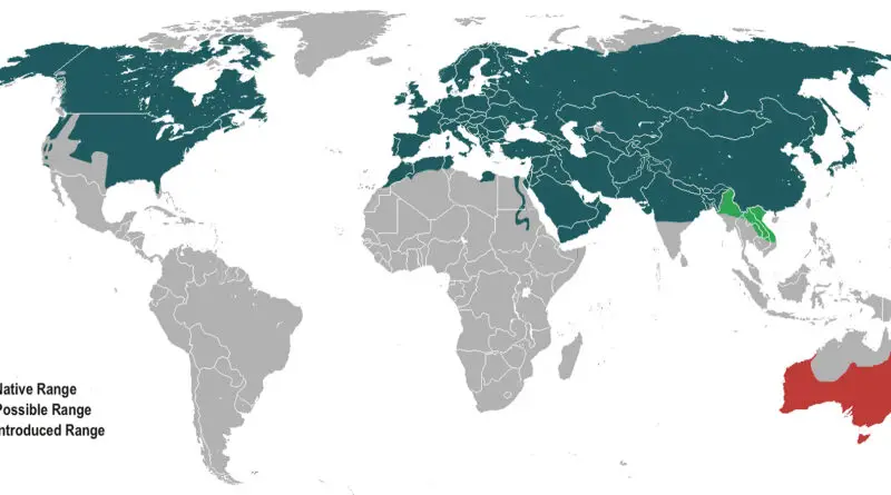
Global Distribution of the Red Fox: The World’s Most Widespread Fox Species
Discover the fascinating story of the red fox, the world’s most widespread fox species, thriving across continents with unmatched adaptability. From its global distribution to its role as an invasive species in Australia, explore how this resilient animal has captivated ecosystems and cultures alike.
Read More