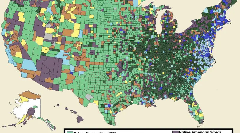
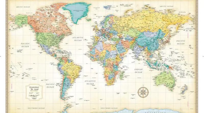
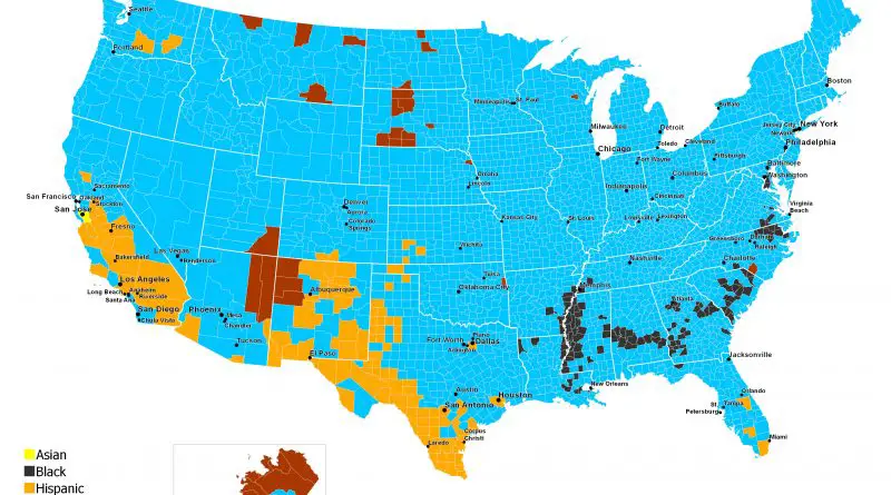
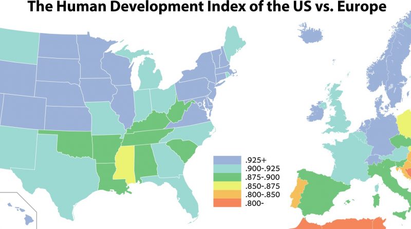
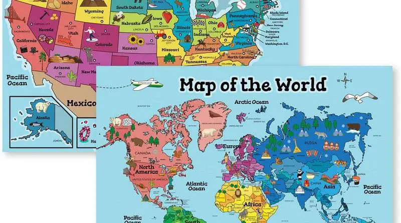
Axonometric Map of NYC: A Journey Through Time
Dive into the history of New York City with Constantine Anderson’s axonometric map, and explore how the city’s population, skyline, and real estate have transformed over the decades.
Read MoreDive into the history of New York City with Constantine Anderson’s axonometric map, and explore how the city’s population, skyline, and real estate have transformed over the decades.
Read MoreDelve into the chilling history of cannibalism with “The Cannibal Map of the World (1893).” Understand its occurrence throughout history, across different cultures and societies, and learn about its presence in the animal kingdom and among early humans. Discover more in this detailed exploration of a dark chapter in human history.
Read MoreDiscover the best and worst states for take-home pay on a $100,000 salary. Our detailed maps and analysis reveal how taxes and geography impact your net income across the United States.
Read MoreOur United States map reveals dramatic population shifts from 1990 to 2022. See which counties boomed, which declined, and understand the forces reshaping America’s demographic landscape.
Read MoreExplore the Spilhaus projection, a fascinating world map that places the oceans at the center, revealing their crucial role in Earth’s ecosystem. Compare with the Dymaxion projection for a new perspective on our planet.”
By exploring these diverse world map projections, we gain a deeper understanding of our planet’s geography and the critical role of the world’s oceans in sustaining life.
Read MoreIn 2011, for the first time in United States history, non-Hispanic whites accounted for under half of the births in
Read MoreExplore the incredible diversity of California’s landscapes through the lens of the Paramount Studio map of 1927. Learn how this state can replicate regions like the French Alps, Siberia, the Sahara Desert, and more, making it a favorite for filmmakers around the world.
Read MoreDive into the world of emojis and uncover the most used emojis globally, their evolution since 1997, and the unique ways different countries use them. Learn how emojis have become a universal language in our digital communication.
Read MoreExplore a fascinating world map that reshapes countries based on population size, not land area. This unique cartogram offers a fresh perspective on global demographics, revealing surprising insights about our planet’s 7.633 billion inhabitants.
Read MoreThe world faces a severe opioid crisis, with countries like the US, Russia, and Ukraine experiencing high mortality rates. This article delves into the causes, demographics, and trends of opioid-related deaths, offering insights into global efforts to address this pressing issue.
Read More