
Charts
The distribution of wealth in the U.S.
50 percent of the wealth in the United States is the located in the green circle The distribution of wealth
Read more: The distribution of wealth in the U.S.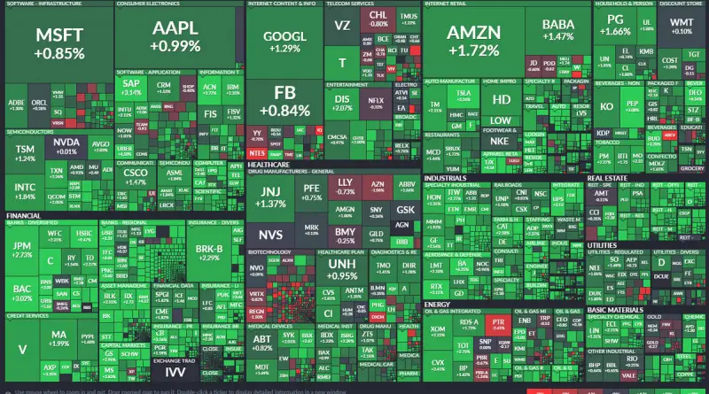
The stock market maps
A stock market map is an intuitively visual depiction of real-time and historical market information. You can use these maps as an investment analysis tool to observe the performance of various market indices, asset classes, sectors, or specific stocks.
Read more: The stock market mapsCity “liveability” index
Best places to live (2015) 1. Melbourne 2. Vienna 3. Vancouver 4. Toronto 5. Calgary/Adelaide 7. Sydney 8. Perth 9.
Read more: City “liveability” indexDome truths and pillar talk
The shape of the world’s demography is changing (1970-2060).
Read more: Dome truths and pillar talk