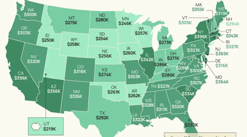
Skip to content
Vivid Maps Logo

Vivid Maps

Maps that explain the World


  • Atlases
  • Map Posters
  • Scratch Maps
  • Globes

Economic maps

Maps to explain economic geography.

Which countries contribute a greater proportion of global CO2 emissions than they contribute to global GDP?
Economic maps Environment maps 

Which countries contribute a greater proportion of carbon dioxide emissions than they contribute to global GDP

September 13, 2019August 26, 2020 Alex 0 Comments carbon dioxide, CO2, emission, GDP, PPP

10 developed nations contribute more than 68% of global greenhouse gas emissions. These maps show which countries pollute the most disproportionately for their level of consumption, production and contribution to the global GDP in PPP.

Read more
Most Expensive U.S. Metropolitan Areas
Economic maps 

What is the Real Value of $100 in the U.S. States and Metropolitan Areas?

August 29, 2019January 11, 2020 Alex 0 Comments Purchasing power, United States

U.S. Bureau of Economic Analysis published data on the real purchasing power of $100 in different U.S. states and metropolitan areas.

Read more
Economic maps 

Countries of the world where it is easier to achieve the American Dream than it is in the U.S.

August 19, 2019August 19, 2019 Alex 0 Comments economic mobility, United States

The American dream is defined as having uphill economic mobility. Being born poor, and dying in a higher economic class than you were born into.

Read more
Economic maps 

Comparison of the Wealth

August 19, 2019August 20, 2019 Alex 0 Comments Europe, Germany, Netherlands, Russia, wealth

National net wealth is the total amount of the value of a nation’s assets minus its debts. It refers to the total value of net wealth owned by the residents of a nation.

Read more
Gold Reserves
Economic maps Infographics Resources 

The Countries With The Largest Stockpiles Of Gold

June 1, 2019June 1, 2019 Alex 0 Comments gold

This infographic from finance site HowMuch.net made using data from Gold.org, gives us a better sense of which countries have the most gold reserves.

Read more
Paper standards
Economic maps 

Paper sizes world map

June 1, 2019June 1, 2019 Alex 0 Comments Maps of world, paper, standards

8.5×11 has been around for more than a century. 8.27×11.69 was made an international standard in the 1970s. Most of Europe had already adopted it since the 20s.

Read more
International Number Ones
Economic maps 

What the world’s nations are best at, revealed in one map

March 13, 2019March 13, 2019 Alex 0 Comments Maps of world

Every country is the best or the worst at something. So what your specific country best or worst at in the entire world?

Read more
The Average Tax Refund in Every State
Economic maps 

Average Tax Refund in Every U.S. State

February 15, 2019February 15, 2019 Alex 0 Comments Taxes, United States

How much does the average person get back on their taxes. The average federal refund was $2,727 last year. Texans

Read more
wealthiest and pooriest U.S counties
Economic maps Infographics 

The Wealthiest and Poorest County in Every U.S. State

February 12, 2019February 12, 2019 Alex 0 Comments United States

The poorest and wealthiest county in every State based on median household income. Top ten wealthiest U.S. counties by median

Read more
The Cost of Eating Out
Business Cities Economic maps 

How Much The Average City-Dweller Spends On Takeout In A Lifetime in the U.S.

January 28, 2019October 23, 2019 Alex 0 Comments Cities, United States

The map below shows which U.S. cities actually spend the most and the least on takeout. Top 10 U.S. Cities

Read more
Page 2 of 68«12345...102030...»Last »

Advertisement

Find Us On Facebook

Vivid Maps

Trending now

  • Historical Maps
  • Great Lakes
    Lakes
  • Maps 2020
    News, Vivid maps
  • Historical Maps, Infographics
  • Nine Ways to Divide Turkey
    Mapping Stereotypes

Advertisement


Globe drinks cabinets · Board games · Monopoly · Map-based strategy board games

Vivid Maps Tools

– Find cities with a similar climate
– Find cities with a similar climate (2050)
– How hot cities could be in 2050
– The U.S. Population Lines
– Convert Latitude/Longitude

– About

Copyright © 2021 Vivid Maps. All rights reserved.