The atlas of economic complexity
The Globe is built upon The Atlas of Economic Complexity, a powerful interactive tool that enables users to visualize a
Read More
The Globe is built upon The Atlas of Economic Complexity, a powerful interactive tool that enables users to visualize a
Read MoreIn descending order of number of new titles per year, as of the latest year available, sometimes “new titles &
Read MoreVia www.recoverybrands.com
Read MoreThis animation is a global visualization of the first year of carbon dioxide measurements (Sept. 2014 – Sept. 2015) from
Read MoreAnimated map of the contiguous 48 States showing every country boundary change from 1629 onwards, and State border changes from
Read MoreVia economist.com
Read MoreThis is an animated visualization of the startling decline of Arctic Sea Ice, showing the minimum volume reached every September
Read More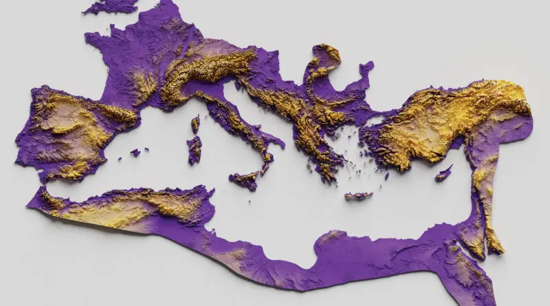
At its zenith under Emperor Trajan, the Roman Empire spanned 5 million square kilometers, from Britain to the Euphrates. Discover how natural barriers shaped its borders and strategy, and compare its vast expanse to modern nations through our interactive maps.
Read More