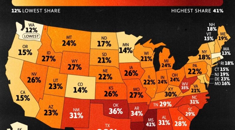
What do Americans think about the rest of the world?
A map shows how Americans view other nations—friends, foes, or unfamiliar. It’s a glimpse into global opinion shaped by history, politics, and perception.
Read MoreA map shows how Americans view other nations—friends, foes, or unfamiliar. It’s a glimpse into global opinion shaped by history, politics, and perception.
Read MoreSlavery in the Americas began with the arrival of the first Africans, who were primarily imported by Spain and Portugal. This brutal practice expanded significantly with the establishment of sugar plantations in Brazil and spread throughout the continent. Millions of Africans were forcibly brought to the Americas, shaping the economic and social foundations of the New World by the 18th century.
Read MoreLooking at this sprawling linguistic puzzle across Europe, I’m struck by how much story lives in every colored region on this remarkable map of Europe. As someone who spends their days thinking about how species distribute across landscapes, I can’t help but see parallels in how languages have carved out their territories over millennia.
Read MoreWhat happens when you map the fastest way to drive from the center of the U.S. to every county? This post explores a mesmerizing visualization that turns America’s road network into something resembling a river system, all flowing outward from Kansas.
Read MoreIndonesia consists of more than 17,000 islands. It is the world’s largest island country and the 14th-largest country by land area, at about 1.9 million sq km (0.7 million sq. ml). With over 268 million people, it is the world’s 4th-most-populous nation and the most populous Muslim-majority nation.
Read MoreFrom 2015 to 2025, artists and media outlets created revealing maps showing Donald Trump’s perspective on the world. This collection of satirical cartography, featuring works from The New Yorker, HuffPost, and political cartoonists, charts the evolution of Trump’s global outlook through data and wit.
Read MoreEver wonder why some U.S. regions experience massive temperature swings while others stay remarkably stable? A fascinating NOAA-based map reveals Colorado’s staggering 69°F (38°C) difference between summer highs and winter lows, while coastal areas like Southern Florida maintain gentle 20-30°F (11-17°C) variations. From Death Valley’s record-breaking 134°F (56.7°C) to Hawaii’s steady 15-20°F (8-11°C) range, discover what creates these dramatic climate differences and how they’re projected to intensify over the coming decades.
Read MoreThe UK map shows where Millennials outnumber Baby Boomers—and why it matters. Explore the population trends behind this generational geography.
Read MoreDid Stalin really plan to conquer the world? A 1952 magazine map claimed to reveal his Cold War strategy. Explore the history, the defector’s claims, and why the map still sparks debate today.
Read MoreA closer look at the U.S. Senate’s evolution from 1789 to 2018—complete with an animated map showing political changes, long vacancies, and the structure of the chamber itself.
Read More