Size Comparison of the UK’s 30 Most Populous Urban Areas
How big is Greater London compared to other UK cities—or global giants like Tokyo and New York? This post ranks the top 30 built-up areas in Britain.
Read More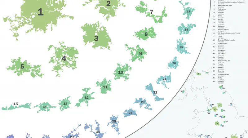
How big is Greater London compared to other UK cities—or global giants like Tokyo and New York? This post ranks the top 30 built-up areas in Britain.
Read More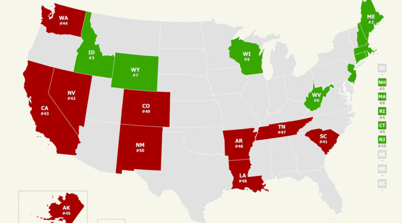
How safe is your state? Our analysis of the 2025 U.S. News & World Report public safety rankings uncovers unexpected trends across America. Through interactive maps, we discover why New England tops the safest states and some others struggle with ongoing problems.
Read More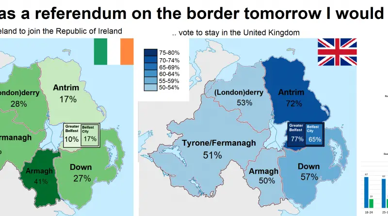
A 2016 map illustrates Northern Ireland’s regional perspectives on a potential border referendum, revealing the complexities of public opinion.
Read More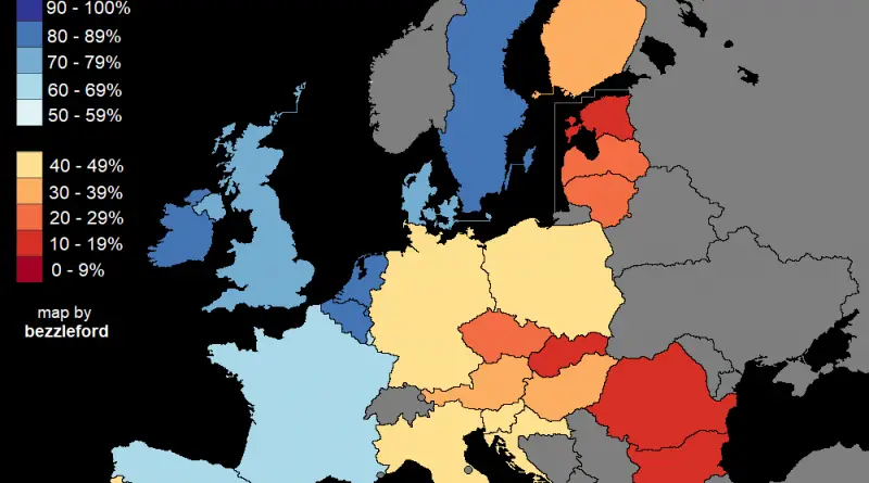
Percent of people who said they would be comfortable with a gay, lesbian, or bisexual in the highest elected political
Read More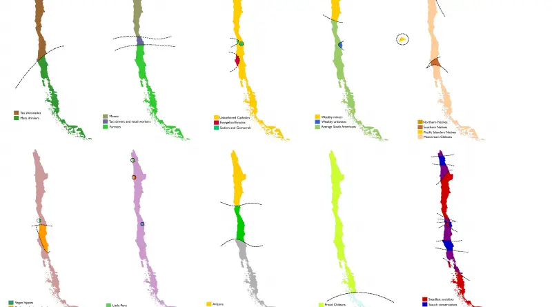
Chile as you’ve never seen it: tea lovers, proud miners, vegan hippies, and even Croatian separatists — all mapped out. These fun stereotype maps explore how Chile might see itself.
Read More
More than half of Nevada’s 3.2 million people live in the Las Vegas area, with Clark County alone housing about 2.34 million. New stats and local insights ahead.
Read More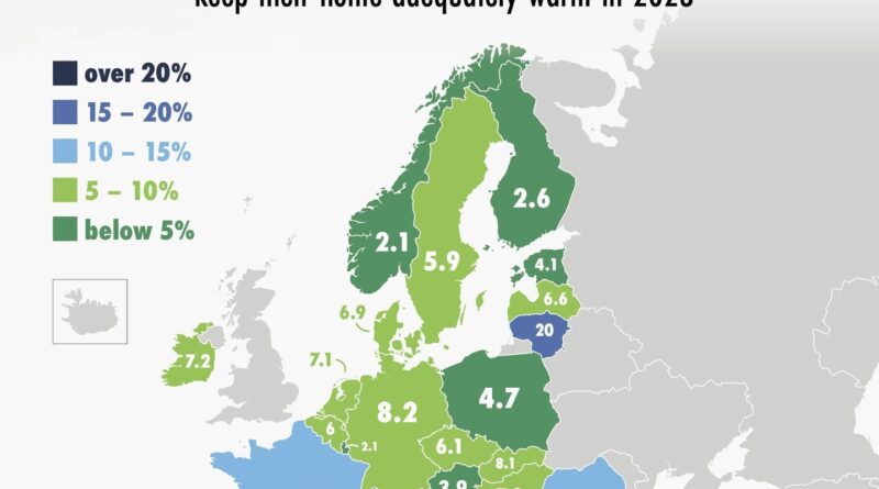
In parts of Europe, staying warm in winter is still a financial struggle. These two maps, based on Eurostat data, show how things changed from 2016 to 2023.
Read More
Reddit user bezzleford created stereotype-based maps of South Africa showing how locals see their own country — through race, voting habits, tourism, minerals, and even causes of death.
Read More
While most of the nation, and foreigners to France, might say “pain au chocolat”, a stronghold in the southwest has withstood, pridefully, standing to the term “chocolatine”.
Read More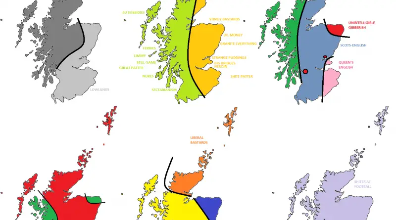
The UK as you’ve never seen it: divided by accents, snacks, and politics. These maps are full of dry humor and local stereotypes.
Read More