U.S. White Non-Hispanic Population under 5 years of age Percent Change by County (2010 – 2014)
Related posts: – White Non-Hispanic population percentage by county – U.S. Population under 5 years of age percent change by county
Read MoreRelated posts: – White Non-Hispanic population percentage by county – U.S. Population under 5 years of age percent change by county
Read MoreThe World Economic Forum’s Networked Readiness Index(NRI), also referred to as Technology Readiness, measures the propensity for countries to exploit
Read More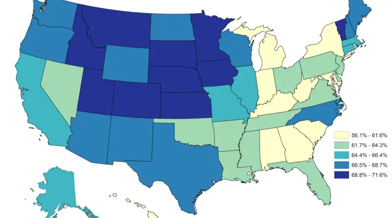
nsightful maps of the United States reveal surprising patterns in Americans’ sleep habits. From Colorado’s well-rested population to Hawaii’s unexpected sleep shortage, these visualizations offer a wake-up call about the importance of getting enough shut-eye. Dive into the regional factors influencing our sleep and learn practical tips for improving your own sleep quality.
Read MoreLondon–it’s quite busy, isn’t it? But maybe more than you even think. As of this time last year, 8.6 million
Read More