London atmospheric emissions inventory
The London Atmospheric Emissions in 3D. Greater London Annual Mean NO2 modeled concentrations for 2020 on a 20m grid. Related
Read more: London atmospheric emissions inventory
The London Atmospheric Emissions in 3D. Greater London Annual Mean NO2 modeled concentrations for 2020 on a 20m grid. Related
Read more: London atmospheric emissions inventory
This interactive map creates randomly-generated state boundaries for the United States, and see who would recent presidential elections under the
Read more: Random states of AmericaEach red dot above represents an oil spill between 2005 & today. There are about 30,000 oil spills per year
Read more: 30,000 of invisible oil spills are destroing the gulfRelated posts: – Mapping Displacement and Gentrification in the San Francisco Bay Area – America’s great housing divide: Are you
Read more: The disappearance of San Francisco’s middle-class neighborhoods (1990 – 2010)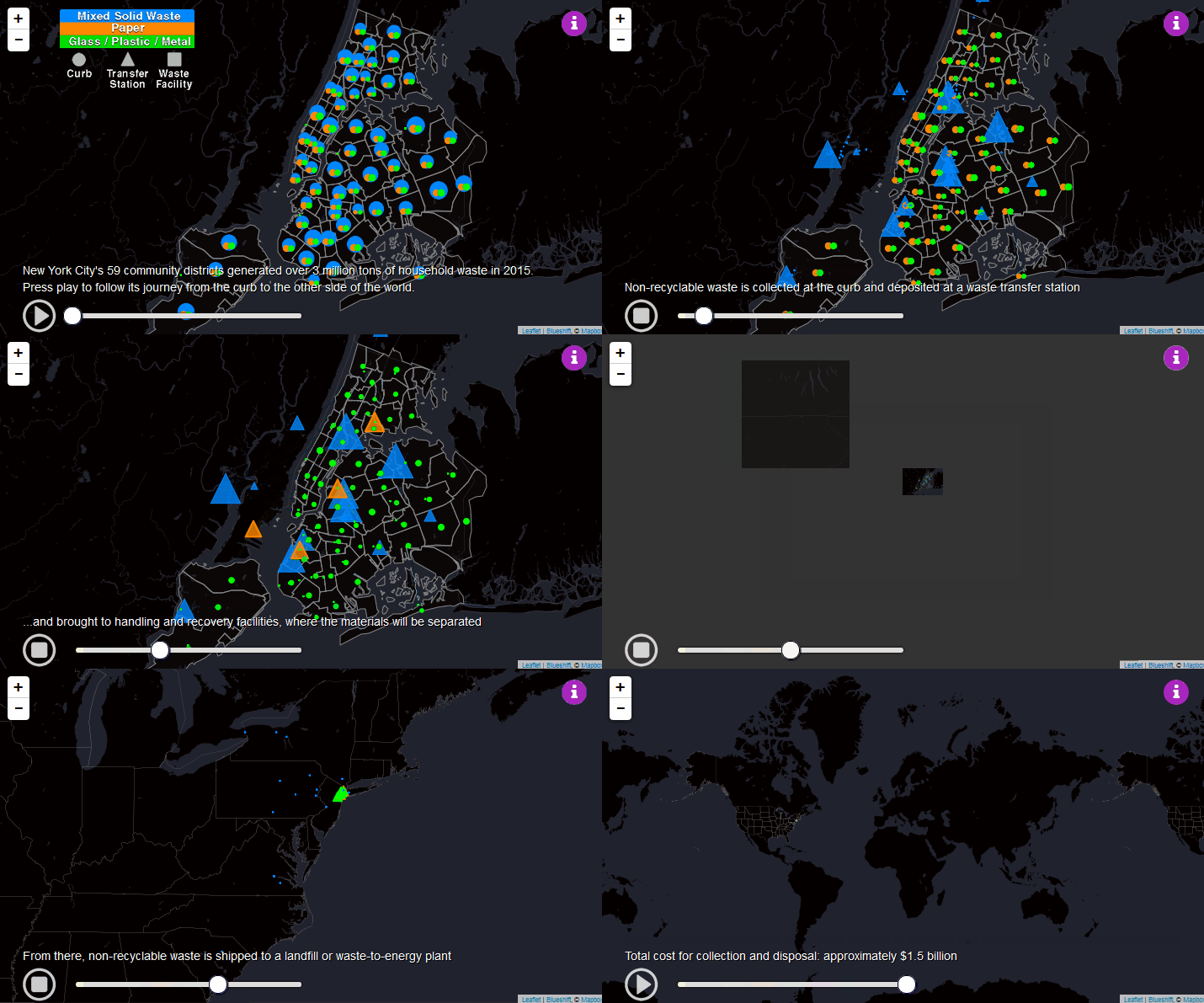
New York City generated over 3 million tons of household waste in 2015. This map follows its journey from the
Read more: The long Journey of NYC solid waste
WHO Guideline values (annual mean) PM2.5: 10 μg/m3 , PM10: 20 μg/m3 The boundaries and names shown and the designations
Read more: Global ambient air pollutionWhich of Europe’s football leagues attract the most fans every season? 1. England and Wales (Premier League) – 13,851,698 2.
Read more: European football leagues by total attendanceNHALE is the first community air monitoring project in Canada. Jointly led by Environment Hamilton and Toronto Environmental Alliance with
Read more: Toronto’s air pollution monitoring map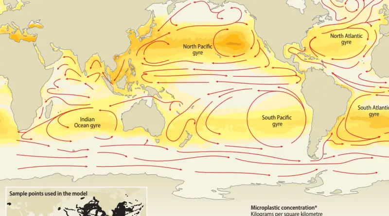
Via www.ecoclimax.com
Read more: Plastic input to the oceans