Percent of housing units where owner pays more of income by U.S. county
Source: metricmaps.org
Read MoreSource: metricmaps.org
Read More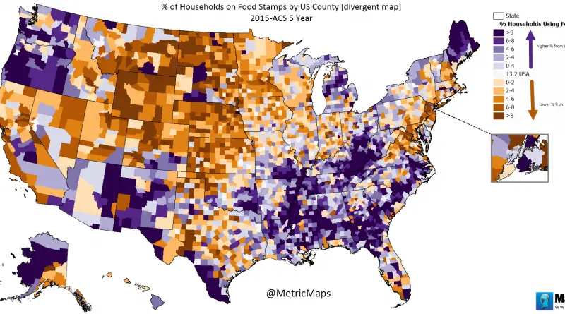
13% of United States households obtain food stamps. Source: metricmaps.org
Read More
Reddit user: sendherhome22
Read MoreReddit user: bezzleford
Read More
People lump Luxembourg with Europe’s tiniest states, but the comparison falls apart when you check the actual sizes. At 2,586 km², Luxembourg dwarfs every other so-called microstate and has the economic clout to match its territory.
Read More
Percentage of adult population (2000 – 2016) Youtube Percentage of adult population (2016) Percent adult population change (2000 – 2016)
Read More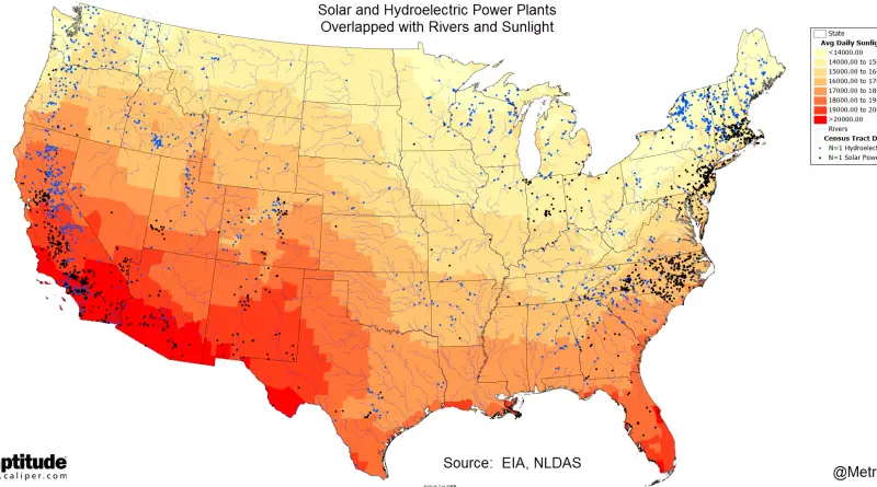
Related post: – Renewable energy production by U.S. state (2016)
Read MoreReddit user: Mainstay17
Read More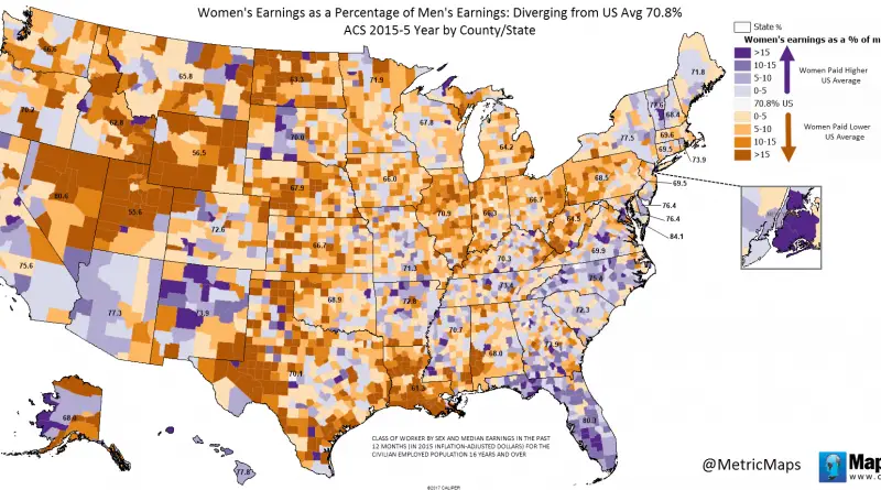
Via metricmaps.org
Read More