The maps of America’s quietest places
New National Park Service map draws the United States’ summer soundscape. The eastern half of the U.S. is louder than
Read MoreMaps of the US
New National Park Service map draws the United States’ summer soundscape. The eastern half of the U.S. is louder than
Read MoreTraditional maps of election results tend to paint the US as red or blue which hides a number of important
Read More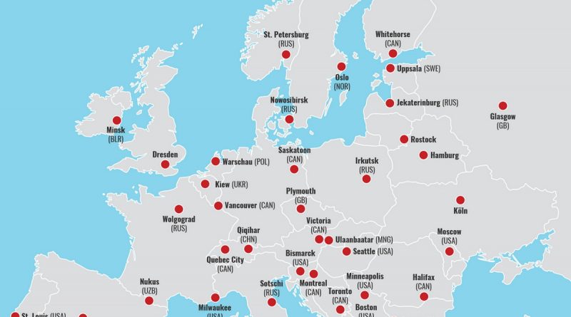
Have you ever questioned what cities or countries sit on the same latitude as you? Miami is on the same latitude as Egypt, San Diego is on Morocco’s same latitude. If Detroit were in Europe, it would be in southern Bulgaria, while New York City and Washington D.C. in Turkey.
Read MoreRed areas will lose population by 2015, while green areas will grow. Darker green areas will grow more than 1.25%
Read MoreThese charts provide several views of a three-dimensional demographic model created with data from the U.S. Census Bureau. The model
Read More