New York city’s schools are even more divided than housing
Estimated income of NYC students & zones Racial makeup of NYC schools & zones Via centernyc.org
Read more: New York city’s schools are even more divided than housing
Estimated income of NYC students & zones Racial makeup of NYC schools & zones Via centernyc.org
Read more: New York city’s schools are even more divided than housingGangs and street crews can be found in every pocket of the city, according to this map based on information
Read more: The gangs of New York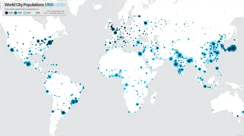
This map visualizes the radical transformation that has occurred across the globe in the last 60 years, from a 30%
Read more: World city populations (1950 – 2030)Kowloon Walled City, located not far from the former Kai Tak Airport, was a remarkable high-rise squatter camp that by
Read more: Kowloon: City of anarchyThe distribution of HIV infections between urban and rural areas varies from country to country. In many countries, large proportions
Read more: The 200 cities with the largest estimates numbers of people living with HIV