Skip to content
VividMaps

  • Atlases
  • Map Posters
  • Scratch Maps
  • Globes
  • Videos
Economic mapsEsriInteractive maps
November 7, 2015 Alex

Ratio of households living above & below the poverty line

This map compares the number of households living above the poverty line to the number of households living below. In

Read more: Ratio of households living above & below the poverty line →

ChartsEconomic mapsLawsMapping Stereotypes
November 7, 2015 Alex

What Is The World’s Happiest, Most Productive Country?

Sources: Gallup (engagement), The Conference Board Via forbes.com

Read more: What Is The World’s Happiest, Most Productive Country? →
BusinessInteractive maps
November 7, 2015 Alex

Africa Map

Africa map is housed at the Center for Geographic Analysis at Harvard University with an initial grant from the Harvard

Read more: Africa Map →
HumorMapping Stereotypes
November 7, 2015 Alex

America the beautiful

Matt Lubchansky (@lubchansky)Via comiccartography.tumblr.com

Read more: America the beautiful →
Economic mapsEUForecasts
November 7, 2015 Alex

GDP Growth forecast 2016

Via europa.eu

Read more: GDP Growth forecast 2016 →
AnimalsLanguagesNature
November 7, 2015 Alex

Stockholm metro stop names translated to English

Read more: Stockholm metro stop names translated to English →
CitiesLanguages
November 7, 2015 Alex

This map shows the most common 2nd languages in places near London Underground stations

Via reddit.com

Read more: This map shows the most common 2nd languages in places near London Underground stations →
Linguistic maps
November 7, 2015 Alex

Irish counties by their literal meaning

Ireland is divided into 32 counties, which are further grouped into 4 provinces: Leinster, Munster, Connacht, and Ulster. It’s important to note that while Northern Ireland is part of the United Kingdom and contains 6 counties (Antrim, Armagh, Derry/Londonderry, Down, Fermanagh, and Tyrone)

Read more: Irish counties by their literal meaning →
Cities
November 6, 2015 Alex

The same number of people live in New York (tiny orange blob on right) & the red region on left

Read more: The same number of people live in New York (tiny orange blob on right) & the red region on left →
FoodMapping Stereotypes
November 6, 2015 Alex

Map of Europe’s national liquors

Read more: Map of Europe’s national liquors →
Economic mapsEU
November 6, 2015 Alex

Taxation in the Europe Union

Read more: Taxation in the Europe Union →
Economic mapsEsriInteractive mapsMapping StereotypesPolitical mapsStory maps
November 6, 2015 Alex

Past as prologue? 2008 presidential election results by precinc

The 2008 presidential election results are a baseline against which the 2012 election can be predicted or compared. Tap on

Read more: Past as prologue? 2008 presidential election results by precinc →
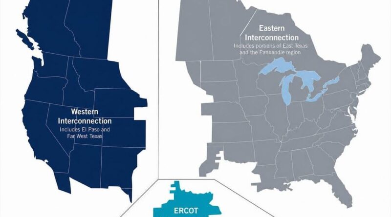
The three power grids it the United States mapped
EnergyInteractive maps
November 6, 2015 Alex

The Three Power Grids that Run the United States

Three grids power the Lower 48, and the line between them was never drawn by geography alone. A short look at how the Western, Eastern, and Texas interconnections took shape.

Read more: The Three Power Grids that Run the United States →
Page 393 of 521« First«...389390391392393394395396397...»Last »

Trending now

  • The World in 50 Million Years: How Our Planet Will Dramatically ChangeDec 7, 2019
  • Map of relief of Europe
    Raised-Relief Maps of EuropeMar 18, 2016
  • Immigrant population in GermanyDec 13, 2018

Related Products

  • Push pin maps
  • Globe drinks cabinets
  • Maps of the United States
  • Board games
  • Monopoly
  • Map-based strategy board games
  • History Board Games
  • Coloring Books
  • Handheld GPS
  • GPS Watches
  • GPS Trackers

Vivid Maps Tools

  • Convert Latitude/Longitude
  • Elevation Finder
  • Distance Calculator
  • Kilometers to Miles Distance & Length Converter
  • Weight Converter
  • Volume Converter
  • Daylight Comparison
  • Time Zone Converter
  • Antipodes Map
  • Find cities with a similar climate
  • Find cities with a similar climate (2050)
  • How hot cities could be in 2050
  • The U.S. Population Lines

Stay connected

Get the latest maps, insights and updates delivered to your inbox.

Unsubscribe anytime.

VividMaps

Maps that explain the world.

Beautiful, data-rich maps to help you understand our world — its people, places and connections.

Explore

World map World atlas Map posters Globes

Company

About Privacy Contact

Stay connected

Follow us for the latest maps, insights and updates.

Independent WebsiteVirusScanner trust report for vividmaps.com
© 2026 Vivid Maps. All rights reserved.
A more connected world