Historical Maps

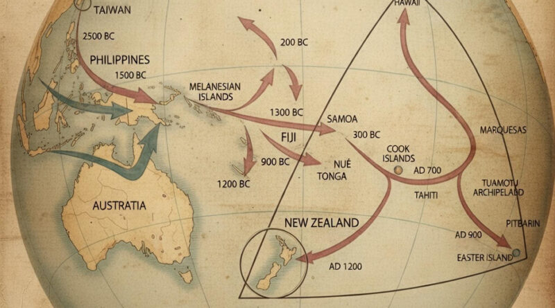
From Taiwan to New Zealand: 4,000 Years of Pacific Migration

People who left Taiwan before 3000 BC eventually reached New Zealand by 1200 AD—a 4,000-year migration across scattered Pacific islands. This map traces the routes and dates of each leg of the journey, from the Philippines (2500 BC) through the Cook Islands (800 BC) to the final settlements in Hawaii, Easter Island, and New Zealand.

Read more: From Taiwan to New Zealand: 4,000 Years of Pacific Migration
Political maps

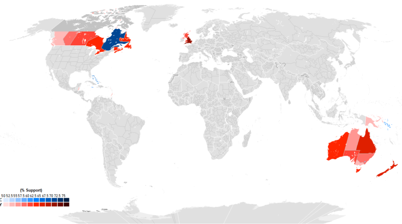
Mapping Monarchy Support Across 15 Commonwealth Realms

Recent polling from 15 Commonwealth realms shows huge differences in how people view having King Charles III as head of state. England leads at 76% monarchy support, with Tuvalu second at 73%. Quebec goes 70% for a republic, standing apart from other Canadian provinces. The Bahamas hits 65% republican sentiment, Jamaica 55%. Australia’s Capital Territory is the only part of that country preferring a republic at 59%. Caribbean nations cite colonial history as a major factor in their views.

Read more: Mapping Monarchy Support Across 15 Commonwealth Realms
Political maps

The Geography of Predictability: 20 States That Never Switch Sides

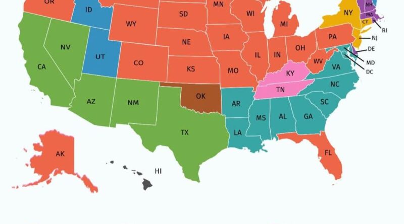
While swing states dominate election coverage, there’s another electoral geography worth examining. Twenty states and Washington, DC have remained remarkably consistent in their presidential voting patterns since 1988, creating a stable foundation beneath the shifting political landscape. Which states have never wavered, and what does their geographical distribution tell us about American political geography?

Read more: The Geography of Predictability: 20 States That Never Switch Sides
Historical Maps

Mapping 9,000 Years: How the World GeoHistogram Shows Every Major Empire on One Timeline

Some maps try to do the impossible. The World GeoHistogram squeezes 9,000 years of civilization onto a single poster—compare Ancient Rome with the Mongol Empire, see when Alexander conquered Persia, figure out which civilizations actually existed at the same time. It’s ambitious, messy, and genuinely useful for understanding historical connections.

Read more: Mapping 9,000 Years: How the World GeoHistogram Shows Every Major Empire on One Timeline