World countries with budget deficit or surplus
Reddit user: trinitronbx
Read more: World countries with budget deficit or surplus
Maps to explain economic geography.
Reddit user: trinitronbx
Read more: World countries with budget deficit or surplus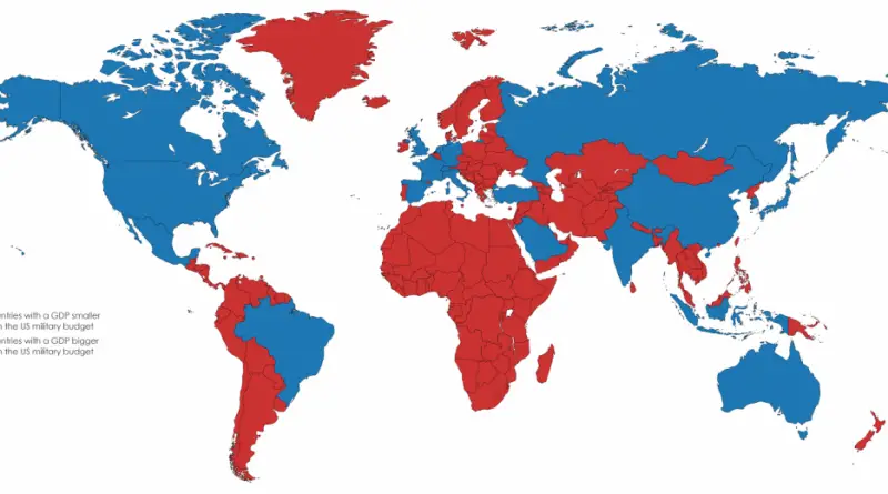
In 2020 the military budget of the United States was about $721.5 billion. It is the largest military budget in the world.
Read more: Countries with a smaller GDP than the U.S. military budgetEvery Country’s Biggest Import – 97 of 187 countries – over half – import some kind of fuel more than
Read more: Every Country’s Biggest Import and Export
Housing affordability has become one of those topics everyone talks about but struggles to quantify. We hear about median prices rising, interest rates fluctuating, and markets “cooling” or “heating up.” But what does affordability actually look like when you map it county by county?
Read more: US Home Affordability Mapped– Despite being a party with usually very low voter share, the FDP (liberals) has participated in almost every German
Read more: Birthplaces of German Members of Government since 1949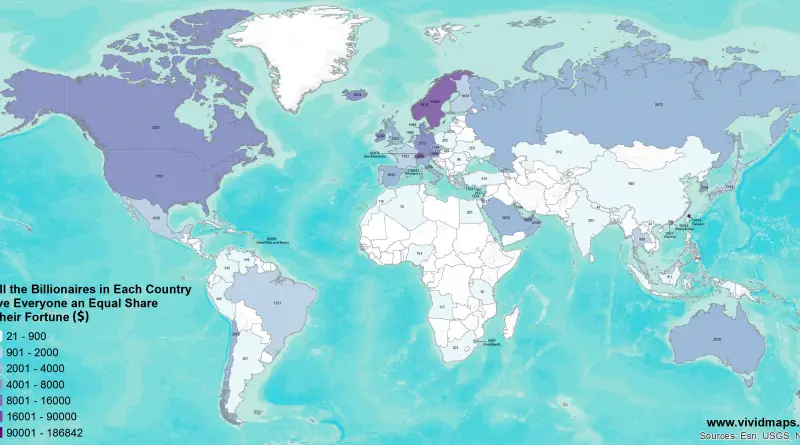
If All the Billionaires in Each Country Gave Everyone an Equal Share of their Fortune ($) If the Richest Billionaire
Read more: If All the Billionaires in Each Country Gave Everyone an Equal Share of their FortuneThis map plots the first year in which the U.S. had the same GDP per capita, adjusted for prices, as
Read more: How long ago was the U.S. as rich as other countries around the world are today?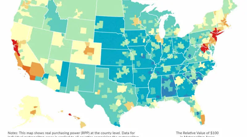
The map below shows real purchasing power (RPP) at the county level. Data for individual metropolitan areas is applied to
Read more: The Relative Value of $100: Which Metro Areas Offer the Biggest Bang for Your Buck?Below best and worst U.S. states by GDP, GDP change, and employment change. Five Best U.S. States 1. California ($2,301B
Read more: Which US States Have Recovered from RecessionSocial scientists have used the Gini coefficient as the most common measure of global inequality (the income or wealth distribution of a nation’s residents). It was developed by the Italian statistician and sociologist Corrado Gini and published in 1912. A Gini coefficient of zero expresses perfect equality, where everyone has the same income. A Gini coefficient of 1 (or 100%) expresses maximal inequality among peoples.
Read more: Inequality Around the World