
Ethnic maps
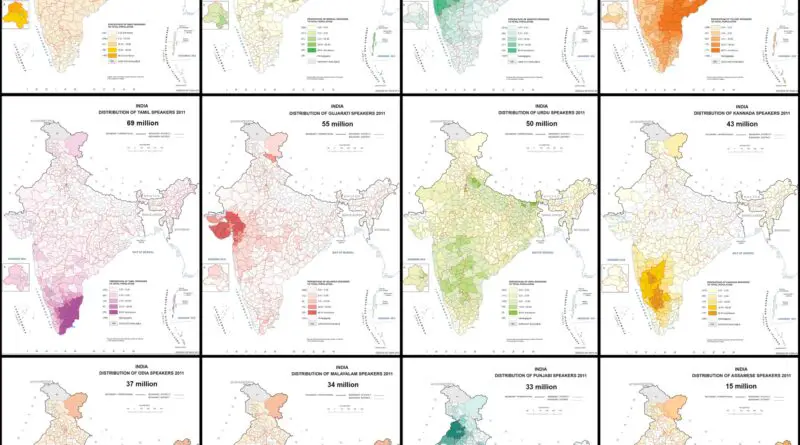
Most Spoken Languages in India Mapped
India is home to several hundred languages, 23 of which only constitutionally recognized official languages. Hindi and English are typically used as an official language by the Central Government.
Read more: Most Spoken Languages in India Mapped
Scandinavians in America
Scandinavians have a significant history of immigration to the United States, which spans several waves over the past few centuries. Scandinavia is a region in Northern Europe that includes countries such as Sweden, Norway, Denmark, Finland, and Iceland. The migration of Scandinavians to America has had a lasting impact on both regions, shaping the culture, economy, and society of the U.S.
Read more: Scandinavians in AmericaNationalities of the German Alliance (1916)
Nationalities of the Central Powers.
Read more: Nationalities of the German Alliance (1916)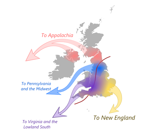
Four British Migrations That Shaped America
Massachusetts doesn’t feel like Virginia for a reason. Between 1620 and 1770, four British regions sent settlers with completely different worldviews. East Anglian Puritans built communal New England. North Midlands Quakers created tolerant Pennsylvania. Southern English gentry ran hierarchical Virginia. Scottish-English borderers settled independent Appalachia. The map shows where they came from and where they went. American regions still reflect those origins.
Read more: Four British Migrations That Shaped America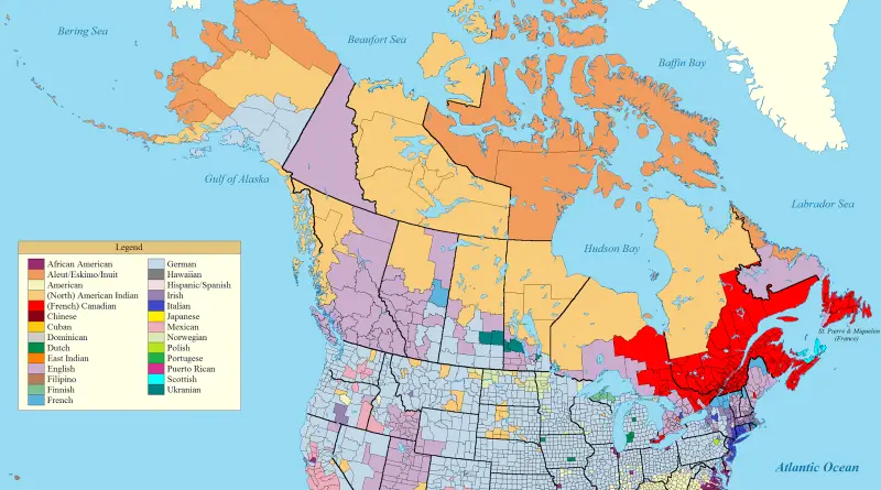
Dominant Ancestry Map of the US and Canada
Germans cover the Midwest—41 million Americans. Wisconsin 37% German, North Dakota 36%, some counties hit 64%. Mexicans cluster along the border at 11% of Americans. African Americans dominate where plantations were. English ancestry leads Appalachia and BC. French fills Quebec and northern Maine. Montana is German, southern Saskatchewan is German. But Washington is German and British Columbia is English. Settlement timing and colonial policies created these patterns that persist today.
Read more: Dominant Ancestry Map of the US and CanadaJewish share of total state/province population in the U.S. & Canada
Related posts: – Jewish population by State (2015)
Read more: Jewish share of total state/province population in the U.S. & Canada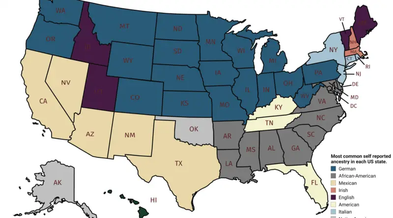
Predominant ancestry in the U.S.
The predominant ancestry in the U.S. is European ancestry. According to the U.S. Census, people of European ancestry make up the largest racial and ethnic group in America, comprising about 60% of the population.
Read more: Predominant ancestry in the U.S.America’s great housing divide: Are you a winner or loser?
The Post analysis, based on data from Black Knight Financial Services spanning 2004 through 2015, shows how the nation’s housing
Read more: America’s great housing divide: Are you a winner or loser?