Skip to content
VividMaps

  • Atlases
  • Map Posters
  • Scratch Maps
  • Globes
  • Videos
Cultural cartographyDemographySliderVivid mapsWorld
July 14, 2016 Alex

Female to male ratio, by NUTS level 3 region

The world average for the ratio of females/males is 0.999, which means there are (fewer) 1.00 females for (more) 1.01

Read more: Female to male ratio, by NUTS level 3 region →

Political maps
July 14, 2016 Alex

Independence Day

1. Asturias 2. Cantabria 3. Basque Country 4. La Rioja 5. Aran Valley 6. Andorra 7. Free County 8. Alsace

Read more: Independence Day →
Animated mapsMapping HealthWars
July 14, 2016 Alex

Mortality rate in England (2001 – 2015)

Via www.ons.gov.uk

Read more: Mortality rate in England (2001 – 2015) →
Political mapsVideo
July 14, 2016 Alex

The 2016 Democratic and Republican Primaries: Every Day

The progress of the 2016 Democratic Primaries each day as well as the voting margins of every county that voted.

Read more: The 2016 Democratic and Republican Primaries: Every Day →
Cultural cartographyInteractive mapsTransport
July 14, 2016 Alex

Highways and Railroads of Australia as a Subway Maps

Highways of Australia mapped in the style of the London Subway Railroad map of Australia Related posts:– Railroads of Africa

Read more: Highways and Railroads of Australia as a Subway Maps →
Job
July 14, 2016 Alex

Most disproportionately well-paying job in each US state

Read more: Most disproportionately well-paying job in each US state →
Global WarmingHeat mapsHistorical MapsOld mapsWars
July 14, 2016 Alex

First World War Map from the Daily Mail (1914)

Read more: First World War Map from the Daily Mail (1914) →
Cartograms
July 13, 2016 Alex

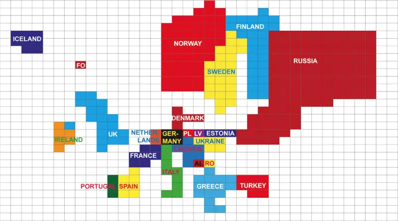
Europe adjusted for length of coastline

1 grid square = 1000 km (621 mi) coastline. Rounded to the nearest 1000. Less than 500 km not included.

Read more: Europe adjusted for length of coastline →
Economic mapsEnergyHumorInternet
July 13, 2016 Alex

Map of average U.S. residential electricity price by utility service territory

Read more: Map of average U.S. residential electricity price by utility service territory →
InternetMapping StereotypesTransportVideo
July 12, 2016 Alex

A day over the UK

This data visualisation shows the air traffic coming into, going out of and flying across the UK on a typical

Read more: A day over the UK →
Climate ChangeCrime mapsInteractive maps
July 12, 2016 Alex

CrimeTeller: Crime street view

Crime Teller provides a crime map at street level. It uses a new geographic information system (GIS) technology. You can

Read more: CrimeTeller: Crime street view →
Energy
July 12, 2016 Alex

Where did recent gas price declines affect consumers the most?

How falling gas prices fuel the consumer interactive map. Via JPMorgan Chase Institute

Read more: Where did recent gas price declines affect consumers the most? →
Mapping StereotypesWorld
July 12, 2016 Alex

What’s across the ocean?

Europe is not across the ocean from New York… but Australia is. By Max Galka via Metrocosm

Read more: What’s across the ocean? →
Page 262 of 522« First«...258259260261262263264265266...»Last »

Trending now

  • World Map of the Most Uniquely Popular Word On Every County's Wikipedia Page
    The Most Uniquely Popular Word on Each Country’s Wikipedia Page MappedDec 1, 2022
  • Map of U.S. Population Density Change
    U.S. Population Density MappedAug 23, 2018
  • World map: Global Median Monthly NET Wages
    The Countries With the Highest and Lowest Wages in 2026Sep 27, 2026

Related Products

  • Push pin maps
  • Globe drinks cabinets
  • Maps of the United States
  • Board games
  • Monopoly
  • Map-based strategy board games
  • History Board Games
  • Coloring Books
  • Handheld GPS
  • GPS Watches
  • GPS Trackers

Vivid Maps Tools

  • Convert Latitude/Longitude
  • Elevation Finder
  • Distance Calculator
  • Kilometers to Miles Distance & Length Converter
  • Weight Converter
  • Volume Converter
  • Temperature Converter
  • Antipodes Map
  • Find cities with a similar climate
  • Find cities with a similar climate (2050)
  • How hot cities could be in 2050
  • The U.S. Population Lines

Stay connected

Get the latest maps, insights and updates delivered to your inbox.

Unsubscribe anytime.

VividMaps

Maps that explain the world.

Beautiful, data-rich maps to help you understand our world — its people, places and connections.

Explore

Interactive world map World atlas Map posters Globes

Company

About Privacy Contact

Stay connected

Follow us for the latest maps, insights and updates.

© 2026 Vivid Maps. All rights reserved.
A more connected world