The Twitter Search Map
The Tweet map allows you to search for the geographical distribution of words used in Twitter messages around the World.
Read More
The Tweet map allows you to search for the geographical distribution of words used in Twitter messages around the World.
Read MoreThis innovative dot map provides an unparalleled look at the spatial distribution of Indigenous Australians, with one dot representing each of the nearly 700,000 individuals counted in the 2011 Census. By placing every person on the map, this visualization offers invaluable insights into the diversity and complex settlement patterns of Australia’s First Nations communities.
Read More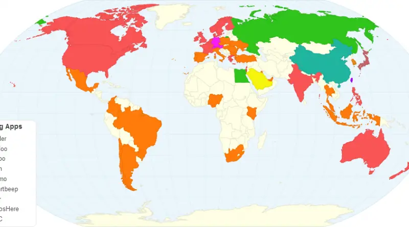
Millions of people use dating apps to overcome social barriers, busy schedules and shyness in their hunt for “the one”.
Read MorePercent of adults who report owning a smartphone: South Korea 88% Australia 77% Israel 74% US 72% Turkey 59% China
Read MoreThe majority of Europeans want Britain to stay in the EU, according to a new poll. Three in five people
Read MoreNearly 20% of the Amazon and 88% of the Atlantic Forest are gone. Explore the maps that show why this crisis matters, how fast it’s happening, and what we’re losing.
Read More– Malta was the most enthusiastic member, with Maltese participants giving their EU membership a positive rating of 76 out
Read More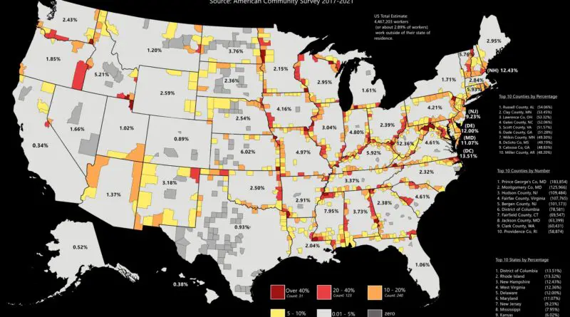
The average one-way commute in the U.S. increased to 27.6 minutes. For comparison, in 2006, the average voyage time for the country was 25.0 minutes. The rise of about 2.6 minutes between 2006 and 2019 shows a growth of about 10 percent over 14 years.
Read More