United States
Maps of the US

Average annual precipitation in Texas
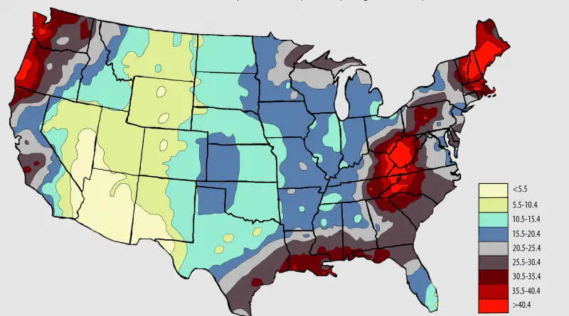
This map is a plot of 1961-1990 annual average precipitation contours from NOAA Cooperative stations and (where appropriate) USDA-NRCS SNOTEL
Read MoreThe share of people without health insurance in the United States
Via nytimes.com Related posts: – Uninsured rate by U.S. State (2008 – 2014) – Uninsured rate by U.S. County (2008
Read More
Size of India compared to United States
How United States population fits into India
Read More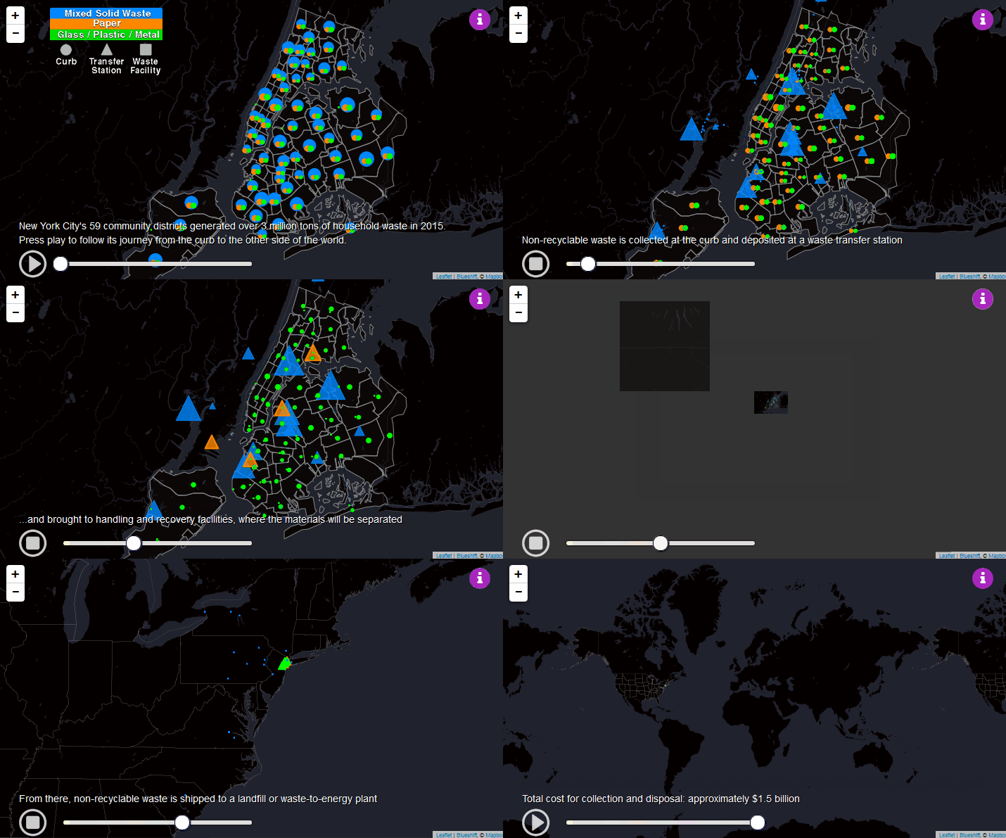
The long Journey of NYC solid waste
New York City generated over 3 million tons of household waste in 2015. This map follows its journey from the
Read More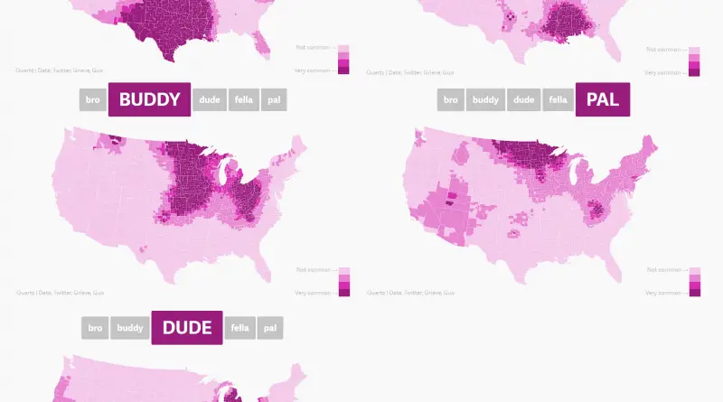
How American men refer to their bros
Related post: – Heat map of curseword frequency in the USA
Read More