Mapping Clinton and Trump’s Upside Potential
Via fivethirtyeight.com
Read MoreVia fivethirtyeight.com
Read More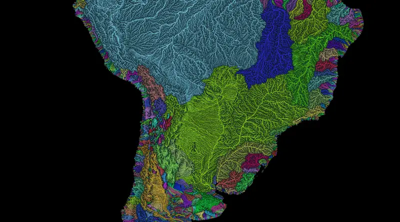
Via etsy.com Related posts: – River basins of Africa in rainbow colours – Rivers of Europe in rainbow colours –
Read More
After around two centuries of low-level trade un the region, the European powers begin to rapidly explore the Arctic from
Read MoreVancouver is divided into different zones which describe the details of permitted development, use, and so forth. If you’ve ever
Read More
“The Hole” is home to around 35600 people across 22000 square miles (about the size of Tasmania or Croatia). For
Read MoreMapping the Globe is a set of interactive visualizations and maps that help us understand where the Boston Globe directs
Read MoreThe maps below split all countries into four distinct categories: least developed countries, developing countries, economies in transition and developed
Read More