
Political maps
Political Maps show governmental and administrative borders of countries, provinces, states, and counties, the location of major cities, and other political units.
The Facebook Primary
Map shows which candidate has the greatest share of Facebook likes by county Map shows which candidates perform best on
Read more: The Facebook PrimaryThe ‘Archipelago of Disconnection’
For territories coloured orange no individual data exists from the World Bank. Potential reasons are for example: some of these
Read more: The ‘Archipelago of Disconnection’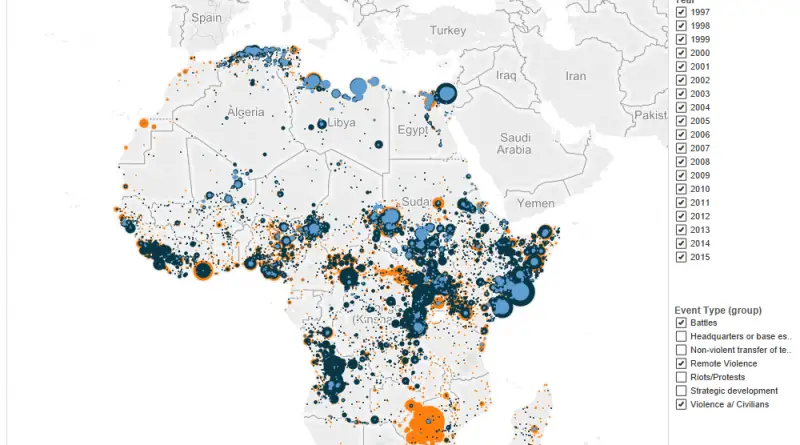
Political Conflict in Africa
www.acleddata.com/visuals/maps/dynamic-maps/
Read more: Political Conflict in AfricaPolitical stability & absence of violence
This map shows “Political stability & absence of violence”, a dimension of governances in Worldwide Governance Indicators (WGI) project by
Read more: Political stability & absence of violenceLocation of conflicts caused by environmental reasons
Conflicts related to water management appear highest in India with 59 cases, followed by conflicts in fossil fuels and climate
Read more: Location of conflicts caused by environmental reasonsCorruption perceptions Index (2015)
The 2015 Corruption Perceptions Index clearly shows that corruption remains a blight around the world. But 2015 was also a
Read more: Corruption perceptions Index (2015)Women in parlaments
Via www.viewsoftheworld.net
Read more: Women in parlamentsFreedom on the Net according to Freedom House (2015)
Related posts: – World Press Freedom Index (2015)
Read more: Freedom on the Net according to Freedom House (2015)Maternal Mortality Rate (2015)
Via www.womanstats.org/newmapspage.html
Read more: Maternal Mortality Rate (2015)