Average annual precipitation in Texas
This map is a plot of 1961-1990 annual average precipitation contours from NOAA Cooperative stations and (where appropriate) USDA-NRCS SNOTEL
Read more: Average annual precipitation in Texas

This map is a plot of 1961-1990 annual average precipitation contours from NOAA Cooperative stations and (where appropriate) USDA-NRCS SNOTEL
Read more: Average annual precipitation in TexasVia nytimes.com Related posts: – Uninsured rate by U.S. State (2008 – 2014) – Uninsured rate by U.S. County (2008
Read more: The share of people without health insurance in the United States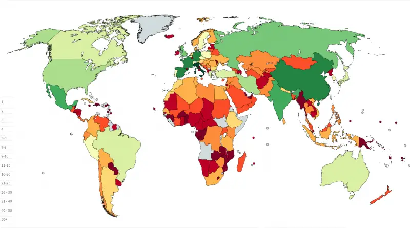
Related posts: – Mapping the intangible cultural heritage – UNESCO World Heritage Sites by Country (Cartogram)
Read more: UNESCO World Heritage Sites Per Country
How United States population fits into India
Read more: Size of India compared to United StatesRelated posts: – Italian seismic hazard map – European Seismic Hazard map
Read more: Seismic risk in ItalyThis video will show the entire history of the British Isles from the arrival of modern humans to 2016. Every
Read more: The History of the British Isles: Every YearOne significant change in the Arctic region in recent years has been the rapid decline in perennial sea ice. Perennial
Read more: Yearly Arctic Sea Ice Age (1984-2016)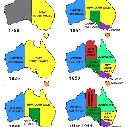
Australia is a vast continent-country known for its unique wildlife, diverse landscapes, and rich cultural history. For tens of thousands of years, Indigenous peoples thrived in various ecosystems, cultivating complex societies and spiritual connections to the land. British exploration and settlement began in the late 18th century, leading to the establishment of a British colony and eventual federation of states in 1901. Throughout the 20th century, Australia played a role in global conflicts, pursued economic growth, and embraced multiculturalism.
Read more: Territorial evolution of Australia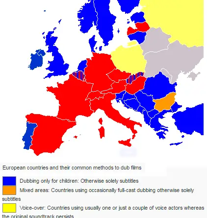
European countries who are dubbing foreign movies vs. countries who use subtitles.
Read more: European countries and their common method to dub films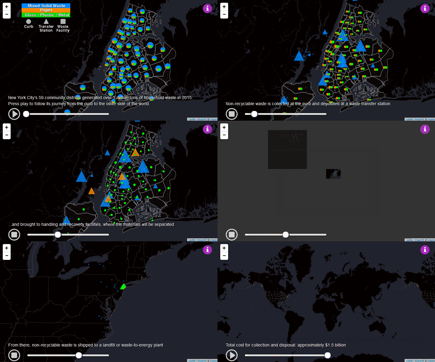
New York City generated over 3 million tons of household waste in 2015. This map follows its journey from the
Read more: The long Journey of NYC solid waste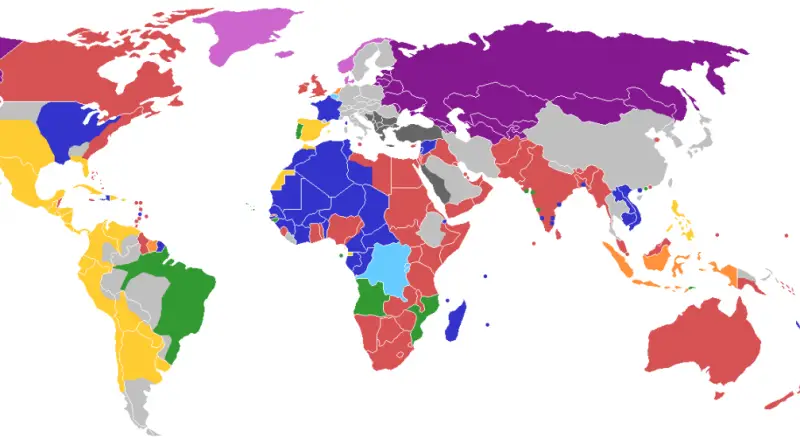
– Great Britain (salmon)– France (dark blue)– Portugal (green)– Spain (yellow)– Netherlands (orange)– Russia (purple)– Norway/Denmark (pink)– Belgium (light blue)–
Read more: Map of the World showing the last European country controlling each territory