Visualising US Exports and Imports
World map of US trade balance World map of US exports World map of US imports Via www.howmuch.net
Read more: Visualising US Exports and Imports

World map of US trade balance World map of US exports World map of US imports Via www.howmuch.net
Read more: Visualising US Exports and ImportsVia thrillist.com What every country in the European Union is worst at: Austria – Most youth smokers Belgium – Worst
Read more: What every country in the European Union is worst atHours of Daylight on the Summer Solstice in the Northern Hemisphere. Via us-climate.blogspot.com Related posts: – Date of latest sunrise
Read more: Hours of Daylight on the Summer Solstice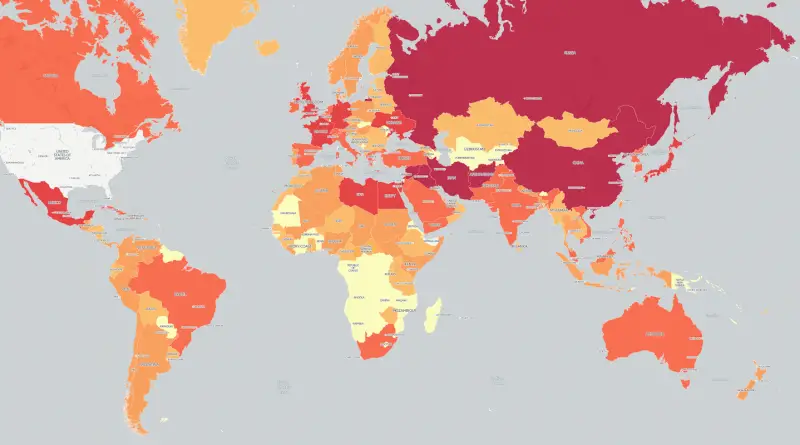
A choropleth map visualizing the total number of times each country in the world has been mentioned on American television
Read more: Mapping 6 Years of American Television NewsThe Jersey Shore is losing year-round residents by the thousands. As the Jersey Shore swells in population from tourists
Read more: New Jersey population changes (2005 – 2014)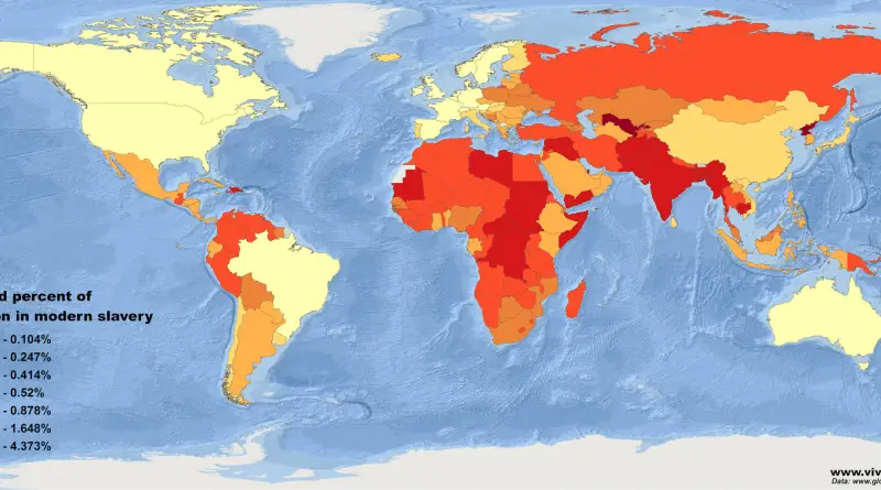
The 2016 Global Slavery Index estimates there are 45.8 million people subject to some form of modern slavery in the
Read more: Where the world’s 45,8 million slaves live?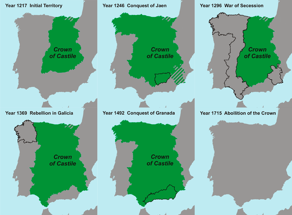
Related posts: – How languages have changed in the Iberian peninsula over the past 1000 years (animated map)
Read more: Borders of the Kingdom of Castile (1217 – 1715)Related posts: – The Jewish population in Europe (1933)
Read more: The Jewish population in Central Europe (1881)Based on birth rates, more than 2 million pregnant women in 20 Zika-prone states and large cities could be at
Read more: Ideal conditions for mosquitoes that can carry the Zika virus
Dive into the geographic intricacies of the 2016 Brexit referendum, examining how various regions across the UK voted and what these patterns reveal about the nation’s political landscape.
Read more: Mapping the Brexit Vote: A Geographic Perspective