Skip to content
VividMaps

  • Atlases
  • Map Posters
  • Scratch Maps
  • Globes
  • Videos
How Safe Is Your State in 2025?
Crime mapsNewsVivid maps
January 11, 2018 Alex

Mapped: The Safest and Most Dangerous States in America

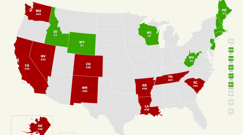
How safe is your state? Our analysis of the 2025 U.S. News & World Report public safety rankings uncovers unexpected trends across America. Through interactive maps, we discover why New England tops the safest states and some others struggle with ongoing problems.

Read more: Mapped: The Safest and Most Dangerous States in America →
If there was a referendum on the Northern Ireland border…
Political maps
January 8, 2018 Alex

What Would Have Happened If Northern Ireland Voted on Irish Unity in 2016?

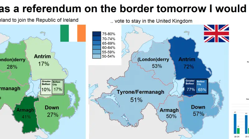
A 2016 map illustrates Northern Ireland’s regional perspectives on a potential border referendum, revealing the complexities of public opinion.

Read more: What Would Have Happened If Northern Ireland Voted on Irish Unity in 2016? →
Sociology
January 7, 2018 Alex

Would you be comfortable with a gay or lesbian leader?

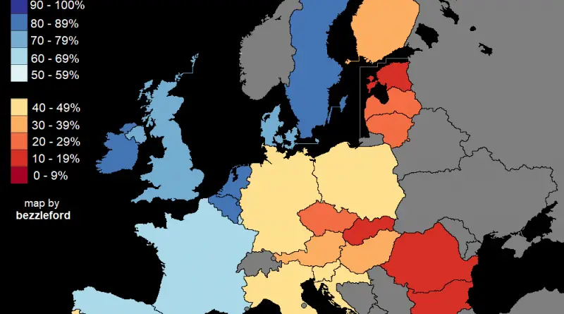
Percent of people who said they would be comfortable with a gay, lesbian, or bisexual in the highest elected political

Read more: Would you be comfortable with a gay or lesbian leader? →
Satirical map
January 7, 2018 Alex

10 Ways to Divide Chile

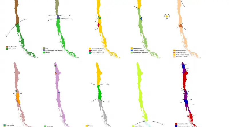
Chile as you’ve never seen it: tea lovers, proud miners, vegan hippies, and even Croatian separatists — all mapped out. These fun stereotype maps explore how Chile might see itself.

Read more: 10 Ways to Divide Chile →
Half the population of Nevada mapped
Population
January 6, 2018 Alex

Half the population of Nevada

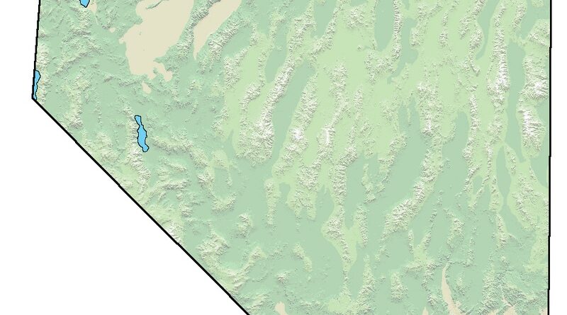
More than half of Nevada’s 3.2 million people live in the Las Vegas area, with Clark County alone housing about 2.34 million. New stats and local insights ahead.

Read more: Half the population of Nevada →
Where people can't afford to heat home mapped
Economic maps
January 6, 2018 Alex

Can You Afford to Stay Warm?

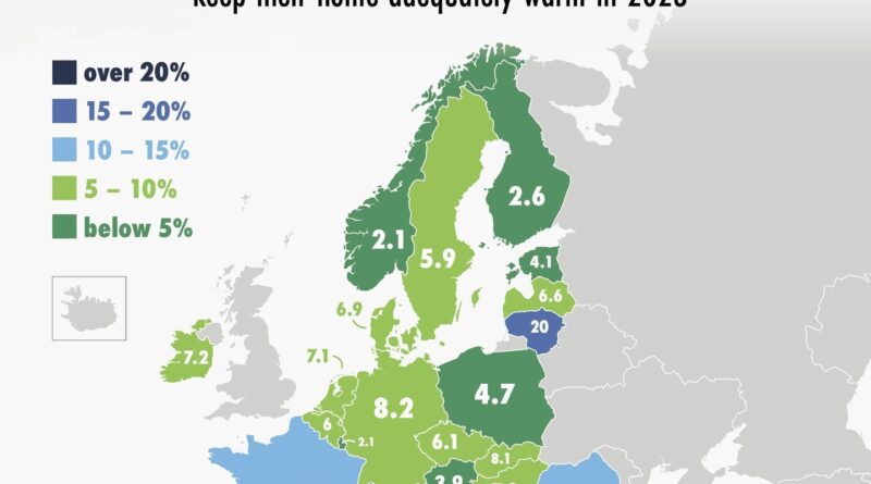
In parts of Europe, staying warm in winter is still a financial struggle. These two maps, based on Eurostat data, show how things changed from 2016 to 2023.

Read more: Can You Afford to Stay Warm? →
Mapping Stereotypes
January 6, 2018 Alex

Tearing South Africa apart

Reddit user bezzleford created stereotype-based maps of South Africa showing how locals see their own country — through race, voting habits, tourism, minerals, and even causes of death.

Read more: Tearing South Africa apart →
CulinaryFoodLanguages
January 6, 2018 Alex

Pain au Chocolat vs Chocolatine

While most of the nation, and foreigners to France, might say “pain au chocolat”, a stronghold in the southwest has withstood, pridefully, standing to the term “chocolatine”.

Read more: Pain au Chocolat vs Chocolatine →
Mapping Stereotypes
January 6, 2018 Alex

Tearing the United Kingdom apart

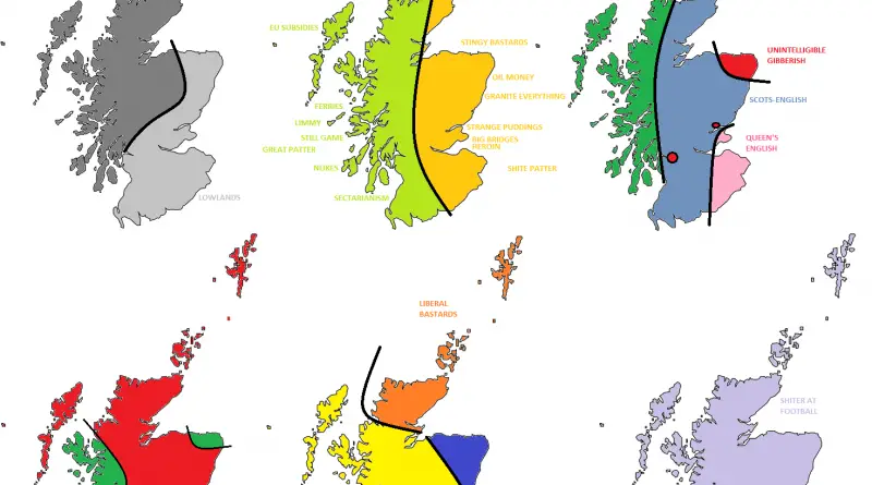
The UK as you’ve never seen it: divided by accents, snacks, and politics. These maps are full of dry humor and local stereotypes.

Read more: Tearing the United Kingdom apart →
Roman Empire Stereotypes mapped
Mapping Stereotypes
January 6, 2018 Alex

6 ways to divide the Roman Empire

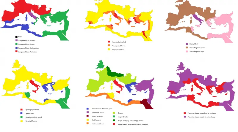
Reddit user CountZapolai redraws the Roman Empire using six sarcastic stereotype maps — from language and drinking habits to who’s really in charge.

Read more: 6 ways to divide the Roman Empire →
Mapping Stereotypes
January 5, 2018 Alex

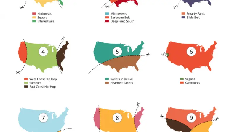
Tearing the United States apart

A diverse population has impacted history in the U.S. from the very beginning. From the first travelers and colonists to the modern-day, the United States has been a country of immigrants. Many groups have combined to shape America’s history and give the society that the country has today. Therefore, differences between U.S. states and territories can be significant.

Read more: Tearing the United States apart →
Mapping Stereotypes
January 5, 2018 Alex

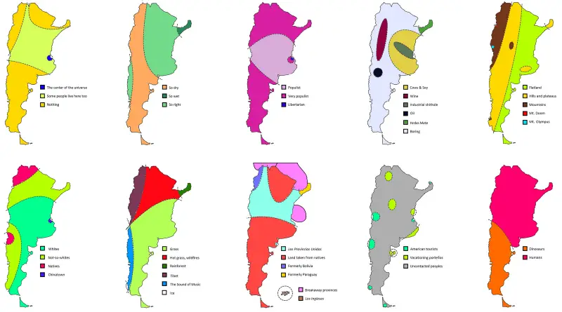
Tearing Argentina Apart

Argentina as seen through memes and maps—19 humorous ways Redditors divide the country by stereotypes, politics, animals, and more.

Read more: Tearing Argentina Apart →
World map of millionaires in 2024
Economic mapsInfographics
January 5, 2018 Alex

Where the World’s Millionaires Live

Compare the top 25 countries with the highest number of millionaires in 2019 and 2024. Find out where wealth is growing, and how the millionaire landscape has shifted worldwide.

Read more: Where the World’s Millionaires Live →
Page 99 of 522« First«...9596979899100101102103...»Last »

Trending now

  • World Map of the Most Uniquely Popular Word On Every County's Wikipedia Page
    The Most Uniquely Popular Word on Each Country’s Wikipedia Page MappedDec 1, 2022
  • World map: Global Median Monthly NET Wages
    The Countries With the Highest and Lowest Wages in 2026Sep 27, 2026
  • Map of U.S. Population Density Change
    U.S. Population Density MappedAug 23, 2018

Related Products

  • Push pin maps
  • Globe drinks cabinets
  • Maps of the United States
  • Board games
  • Monopoly
  • Map-based strategy board games
  • History Board Games
  • Coloring Books
  • Handheld GPS
  • GPS Watches
  • GPS Trackers

Vivid Maps Tools

  • Convert Latitude/Longitude
  • Elevation Finder
  • Distance Calculator
  • Kilometers to Miles Distance & Length Converter
  • Weight Converter
  • Volume Converter
  • Temperature Converter
  • Antipodes Map
  • Find cities with a similar climate
  • Find cities with a similar climate (2050)
  • How hot cities could be in 2050
  • The U.S. Population Lines

Stay connected

Get the latest maps, insights and updates delivered to your inbox.

Unsubscribe anytime.

VividMaps

Maps that explain the world.

Beautiful, data-rich maps to help you understand our world — its people, places and connections.

Explore

Interactive world map World atlas Map posters Globes

Company

About Privacy Contact

Stay connected

Follow us for the latest maps, insights and updates.

© 2026 Vivid Maps. All rights reserved.
A more connected world