Mapping the world’s mortality
The mortality rate is a measure of the number of deaths in a specific population, scaled to that population’s size,
Read MoreThe mortality rate is a measure of the number of deaths in a specific population, scaled to that population’s size,
Read MoreCartogram showing the participating countries in the final of Eurovision Song Contest 2017 resized according to the total number of
Read More
States appear bigger as the difference of households income in between U.S. born and immigrant increases, e.g. Wyoming (+$17,8K). Conversely,
Read MoreTop 10 countries with the largest travel industries (GDP)1. United States ($488 billion)2. China ($224 billion)3. Germany ($130.8 billion)4. Japan
Read MoreWorld population (2000 – 2016) Youtube World population (2016) Cartogram of the World Population (2016) Source: www.vividmaps.com
Read MoreSource: slate.fr Related post: – French Presidential Election (2017)
Read More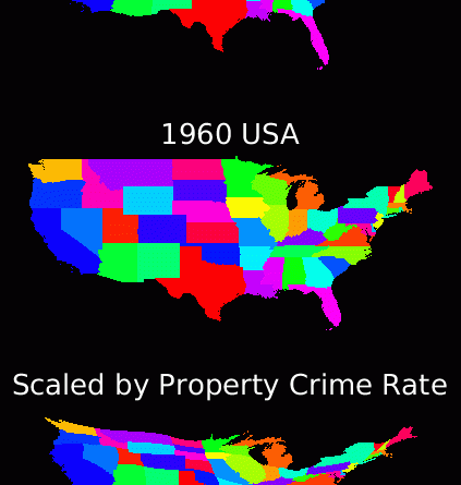
Cartogram generated by running the diffusion equation until crime rate is uniform, and deforming the map with the resulting flux.
Read More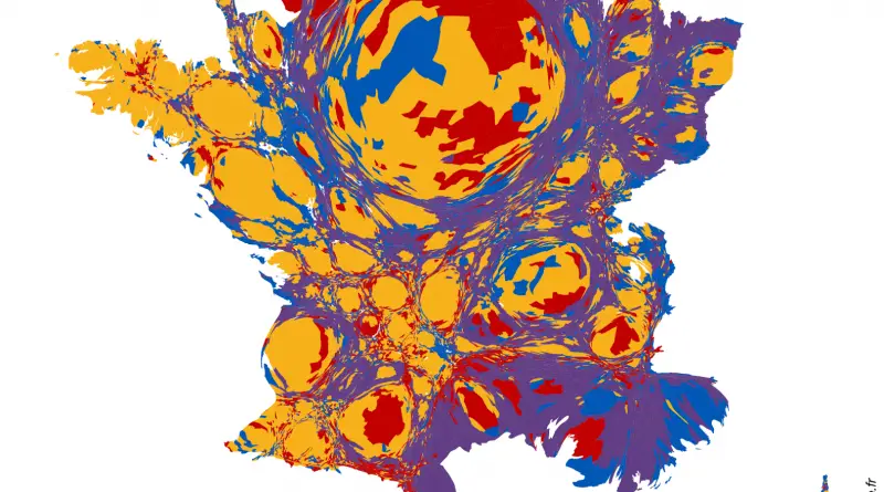
Source: slate.fr Related post: – French Presidential Election (2017)
Read More
The biggest the per-capita debt, the bigger the state. States with the biggest per-capita debt are at the center of
Read MoreWheat is the leading source of vegetal protein in human food, having a protein content of about 13%, which is
Read More