
Environment maps
Maps depicting environmental degradation across planet.
Where the poor live longer
– On average, the life expectancy for a poor 40-year-old in Manhattan is 81.8 years. It is one of the
Read more: Where the poor live longer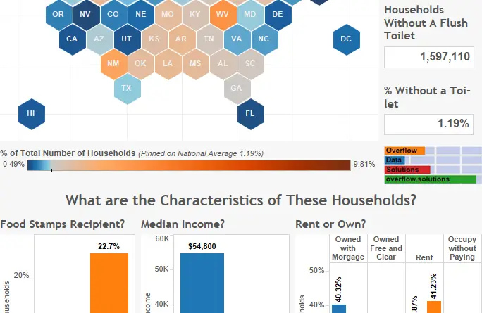
What % of american households don’t have a toilet?
1.19% of households in the U.S. don’t have a flush toilet.
Read more: What % of american households don’t have a toilet?Where are L.A.’s dirtiest streets?
Inspectors gave failing cleanliness grades to more than 370 miles of streets and alleys in Los Angeles, or about 4%
Read more: Where are L.A.’s dirtiest streets?USGS Earthquake Forecast Maps Now Include Human-Induced Earthquakes
For the first time, new USGS maps identify potential ground-shaking hazards from both human-induced and natural earthquakes. In the past,
Read more: USGS Earthquake Forecast Maps Now Include Human-Induced EarthquakesWhere is the lead exposure risk in your community?
In some of America’s oldest and largest urban areas, places like New York and Chicago, one in five census tracts
Read more: Where is the lead exposure risk in your community?Using clouds to locate threatened species
The world map (top right) is coloured according to month of peak cloudiness (top left). Areas of little seasonality are
Read more: Using clouds to locate threatened speciesGlobal Noise Pollution Map
Visualization of noise pollution for the entire world based on top of OSM data. Search for your city and check
Read more: Global Noise Pollution MapWater, jobs and food security
Almost half of the world’s workers – 1.5 billion people – work in water-related sectors. The agricultural industry directly creates
Read more: Water, jobs and food security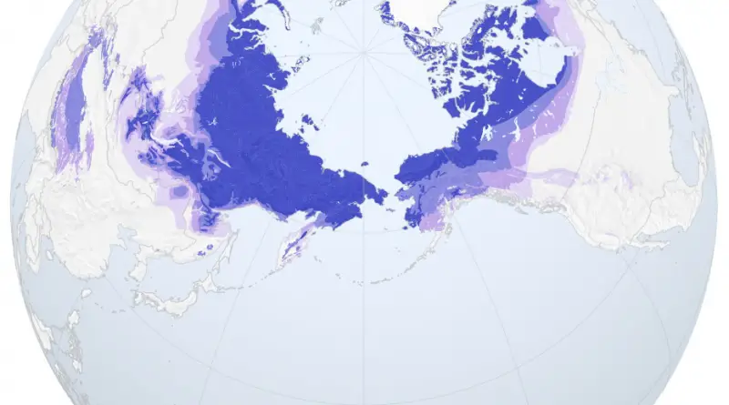
Arctic permafrost
Source: NASA
Read more: Arctic permafrost