Exploring the world of Connectography
This interactive map builds on the global infrastructure networks depicted in Parag Khanna’s 2016 book “Connectography – Mapping the Future
Read MoreThis interactive map builds on the global infrastructure networks depicted in Parag Khanna’s 2016 book “Connectography – Mapping the Future
Read MoreFrom glittering Christmas lights and ice skating to traditional markets and shows, use the filters below to search and plan
Read MoreIn 1652, a contingent of Dutch settlers landed in modern South Africa and founded the Cape Colony. It went on
Read MoreA simulation of a U.S. style presidential vote using the 2014 European elections on a winner-takes-all system, with the biggest
Read More
Reddit user: nahuelacevedopena
Read Morehttps://www.wired.com/2016/11/every-single-name-entrancing-map-music-reference/ Via wired.com
Read MoreVia zeit.de
Read MoreEvery country’s most popular tourist attraction. “What to see in…” Albania – Albanian Riviera Algeria – Notre Dame d’Afrique Azerbaijan
Read More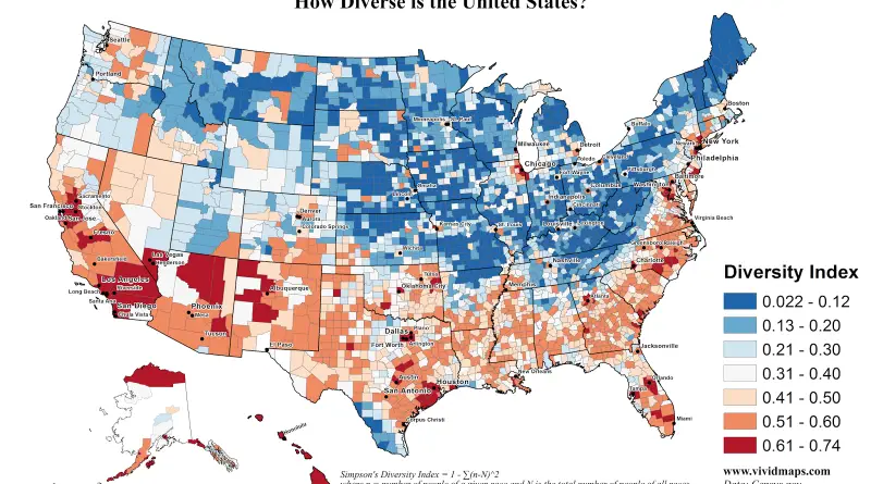
How Diverse is the U.S.? Via vividmaps.com County-level change in diversity since 2000 Via washingtonpost.com
Read More