December through March precipitation anomalies
Via weather.com
Read more: December through March precipitation anomalies
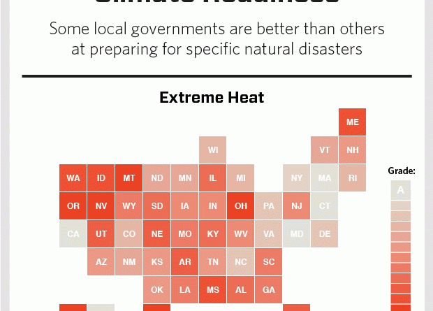
Via www.vocativ.com/news/255866/climate-change-cop21
Read more: Where States stand on climate readinessA geopolitical history of all empires, nations, kingdoms, armies and republics. More than 500 world maps spanning all historical events
Read more: 50 Centuries in 10 MinutesThis map shows how much average temperatures have changed and are likely to change by in future. Scroll through the
Read more: Mapping climate change in South AfricaDo pledges require international climate aid? The map shows how most conditional pledges have been made by nations in the
Read more: Explore the world’s climate pledges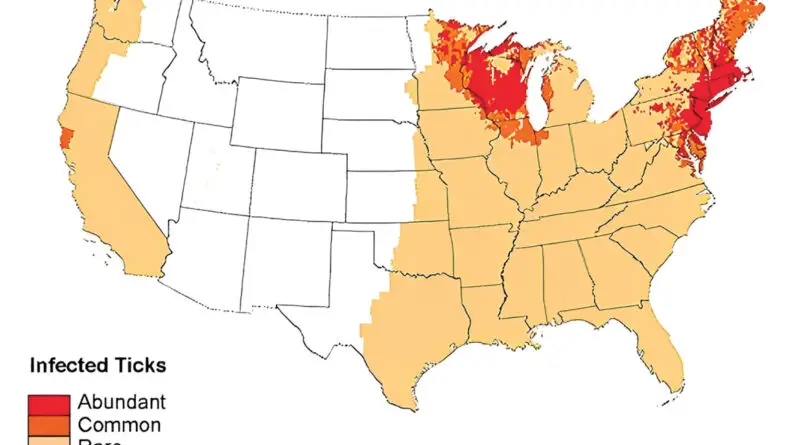
Ticks are parasites, being by feeding on the blood of mammals, birds, and even amphibians. Ticks themselves don’t produce disease, but if a tick is infected with a bacterium or virus, then that pathogen can be transferred within the tick’s bite and cause illness in humans. In the U.S., 9 ticks most often attack humans.
Read more: Geographic distribution of ticks and disease cases in the U.S.Globally speaking, research suggests that countries are actually on track to spend $650 billion on fossil fuel subsidies this year,
Read more: Average G20 fossil fuel subsidiesThis animation is a global visualization of the first year of carbon dioxide measurements (Sept. 2014 – Sept. 2015) from
Read more: Watching carbon dioxide from spaceThis is an incomplete map of deaths that occurred in New York City over roughly the past two years. It
Read more: Death map New YorkRange of the Grey Wolf and its subspecies in Alaska Wolf population in Europe Union
Read more: Historical distribution of the Wolf