Skip to content
VividMaps

  • Atlases
  • Map Posters
  • Scratch Maps
  • Globes
  • Videos
Interactive mapsIsochrone mapsMapping StereotypesScienceTransport
November 15, 2016 Alex

San Francisco: An isochronous map for public transportation

Given a starting point it shows what you can reach within a certain time limit using public transportation (so subway,

Read more: San Francisco: An isochronous map for public transportation →

MoonSpace
November 15, 2016 Alex

Moon calculator: Mapping the Supermoon

Read more: Moon calculator: Mapping the Supermoon →
MappingSlider
November 14, 2016 Alex

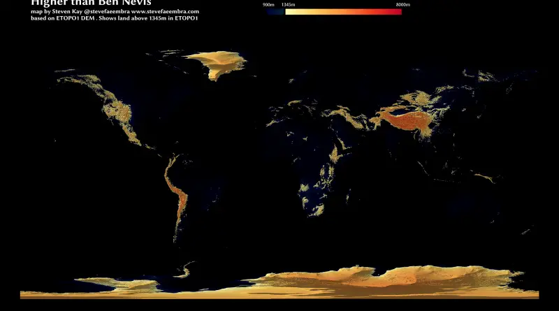
Higher than Ben Nevis (the highest point in the UK)

Via stevefaeembra

Read more: Higher than Ben Nevis (the highest point in the UK) →
Mapping StereotypesMexicoPolitical mapsPopulation
November 14, 2016 Alex

The vote across the Mexican border

Via elpais.com Related posts: – U.S. counties in which party of top vote-getter changed between 2000 & 2016 presidential elections

Read more: The vote across the Mexican border →
Political maps
November 14, 2016 Alex

Canadian Federal Election results, 2008, 2011 & 2015

Read more: Canadian Federal Election results, 2008, 2011 & 2015 →
CarsGeologic mapsInternetLaws
November 14, 2016 Alex

Geological Map of the Ocean Floor

Read more: Geological Map of the Ocean Floor →
Political maps
November 14, 2016 Alex

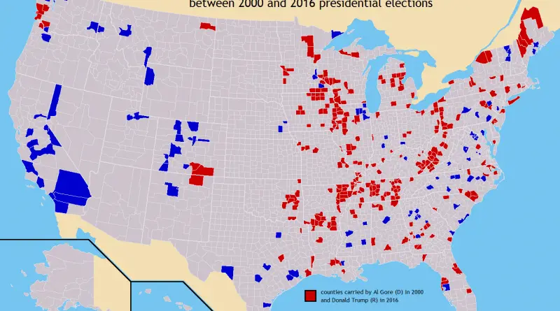
U.S. counties in which party of top vote-getter changed between 2000 & 2016 presidential elections

Related posts: – U.S. Presidential Election 2016 (Cartogram) – How America voted in every election (1824 – 2016) – The

Read more: U.S. counties in which party of top vote-getter changed between 2000 & 2016 presidential elections →
Map ProjectionsWorld
November 14, 2016 Alex

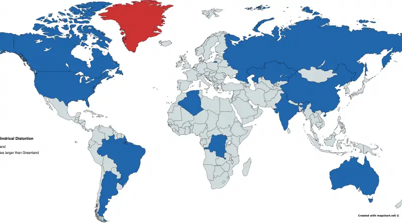
Miller-Cylindrical projection distortions

Red: Greenland  Blue: Countries larger than Greenland

Read more: Miller-Cylindrical projection distortions →
Animated mapsEconomic mapsEnvironment mapsMapping StereotypesPollution
November 14, 2016 Alex

The disappearance of San Francisco’s middle-class neighborhoods (1990 – 2010)

Related posts: – Mapping Displacement and Gentrification in the San Francisco Bay Area – America’s great housing divide: Are you

Read more: The disappearance of San Francisco’s middle-class neighborhoods (1990 – 2010) →
Environment mapsSlider
November 14, 2016 Alex

Black Bear Distribution in New Jersey (1995 – 2014)

Read more: Black Bear Distribution in New Jersey (1995 – 2014) →
Maps of World ReligionsWorld
November 14, 2016 Alex

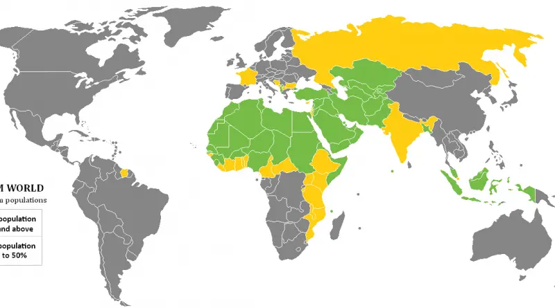
Countries with the largest Islamic population

Read more: Countries with the largest Islamic population →
Map of infant mortality
Animated mapsDemographyMapping Health
November 13, 2016 Alex

Infant mortality over time

In 1990, about 8.8 million infants younger than one year died worldwide. In 2015, this number almost halved to 4.6 million infant deaths.

Read more: Infant mortality over time →
CartogramsPolitical maps
November 13, 2016 Alex

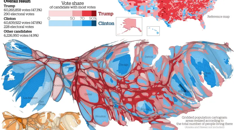
U.S. Presidential Election 2016 (Cartogram)

Results mapped at county level showing the candidate with the largest vote share in each area. Via viewsoftheworld.net Related posts:

Read more: U.S. Presidential Election 2016 (Cartogram) →
Page 215 of 522« First«...211212213214215216217218219...»Last »

Trending now

  • World Map of the Most Uniquely Popular Word On Every County's Wikipedia Page
    The Most Uniquely Popular Word on Each Country’s Wikipedia Page MappedDec 1, 2022
  • World map: Global Median Monthly NET Wages
    The Countries With the Highest and Lowest Wages in 2026Sep 27, 2026
  • The Price of Sex around the World MappedMay 28, 2019

Related Products

  • Push pin maps
  • Globe drinks cabinets
  • Maps of the United States
  • Board games
  • Monopoly
  • Map-based strategy board games
  • History Board Games
  • Coloring Books
  • Handheld GPS
  • GPS Watches
  • GPS Trackers

Vivid Maps Tools

  • Convert Latitude/Longitude
  • Elevation Finder
  • Distance Calculator
  • Kilometers to Miles Distance & Length Converter
  • Weight Converter
  • Volume Converter
  • Temperature Converter
  • Antipodes Map
  • Find cities with a similar climate
  • Find cities with a similar climate (2050)
  • How hot cities could be in 2050
  • The U.S. Population Lines

Stay connected

Get the latest maps, insights and updates delivered to your inbox.

Unsubscribe anytime.

VividMaps

Maps that explain the world.

Beautiful, data-rich maps to help you understand our world — its people, places and connections.

Explore

Interactive world map World atlas Map posters Globes

Company

About Privacy Contact

Stay connected

Follow us for the latest maps, insights and updates.

© 2026 Vivid Maps. All rights reserved.
A more connected world