
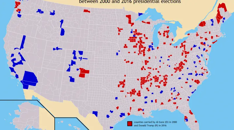
U.S. counties in which party of top vote-getter changed between 2000 & 2016 presidential elections
Related posts: – U.S. Presidential Election 2016 (Cartogram) – How America voted in every election (1824 – 2016) – The
Read more: U.S. counties in which party of top vote-getter changed between 2000 & 2016 presidential elections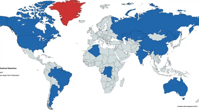
Miller-Cylindrical projection distortions
Red: Greenland Blue: Countries larger than Greenland
Read more: Miller-Cylindrical projection distortionsThe disappearance of San Francisco’s middle-class neighborhoods (1990 – 2010)
Related posts: – Mapping Displacement and Gentrification in the San Francisco Bay Area – America’s great housing divide: Are you
Read more: The disappearance of San Francisco’s middle-class neighborhoods (1990 – 2010)

Infant mortality over time
In 1990, about 8.8 million infants younger than one year died worldwide. In 2015, this number almost halved to 4.6 million infant deaths.
Read more: Infant mortality over time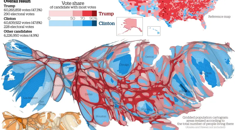
U.S. Presidential Election 2016 (Cartogram)
Results mapped at county level showing the candidate with the largest vote share in each area. Via viewsoftheworld.net Related posts:
Read more: U.S. Presidential Election 2016 (Cartogram)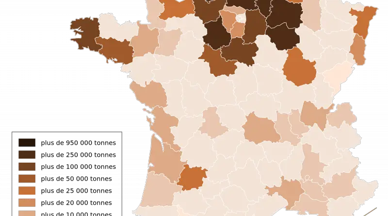
Agriculture in France mapped
there are almost half a million farms in metropolitan France and 25 thousand in overseas territories. It represents a utilized agricultural area of nearly thirty million ha, more than 50% of the French area. This territory is split into three significant crops: 63 percent of cropland (cereal and forage crops mainly), 34 percent of grassland, and 3 percent of perennial crops, orchards, and vineyards.
Read more: Agriculture in France mapped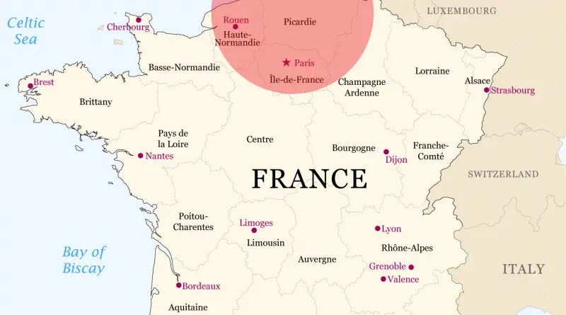

Political Regimes over time (1816 – 2015)
The Polity IV score classifies the type of political regime for each country on a range from -10 (full autocracy)
Read more: Political Regimes over time (1816 – 2015)Map of U.S. Counties by rank away from State Capitol
Related post: – State capitol buildings by state
Read more: Map of U.S. Counties by rank away from State Capitol